Wonder Wheel: Who’s Afraid of Red, Green and Blue?
Vittorio Storaro, ASC, AIC personally details the richly hued artistic strategy he created while shooting Woody Allen's period drama.
Cinematographer Vittorio Storaro, ASC, AIC personally details the richly hued artistic strategy he created to shoot Woody Allen’s period drama.
Unit photography by Jessica Miglio, courtesy of Amazon Studios
(Article sponsored by Amazon Studios)
“I see in colors the effort of matter to become LIGHT.”
— Plato, Greek philosopher
“RED also has an Expiatory, Protective function.”
— Lia Luzzatto and Renata Pompas, Italian scholars
“GREEN is a Moral color.”
— J. M. Vincent, American scholar
“BLUE, King of colors, comforts the Heart.”
— Guillaume de Machaut, French poet
I think I heard someone say: “Look what those two ‘young’ visionaries of the cinematic image, Woody Allen and Vittorio Storaro — one writing with WORDS, the other writing with LIGHT — are up to on their second film together, Wonder Wheel! And they’ve only just entered the world of digital cinema with their first movie, Café Society!”
Indeed, we seemed quite happy in our classic world of celluloid, and so familiar with the mysterious image that is revealed after it has been conceived, as if it were being born. Each film is a specific creature.
Despite our knowledge and our experiences over time, we visualized that IMAGE through dreams or nightmares, according to the various moments and films … right from the start, as soon as it was filmed, not only the first night, but during many nights after the day of shooting … until it was projected on a screen where, after the countdown frames, the first image finally appeared … in motion, with sound … and in COLOR.
Despite the research, knowledge and experience that helped me to “know” how they would turn out, I can honestly say that, like all cinematographers, I always experienced surprise or, more often, wonder — and even disappointment, but luckily only a few times — when I saw on the screen the images that were framed, lit and filmed on the set.
MATTER — the physical elements of the camera, lenses, film stock, etc. — was transformed through the language of LIGHT into visible ENERGY, into an IMAGE.
With that image, all doubts, uncertainties and questions vanished, and we reveled in the WONDER OF CINEMA. A terrific thrill that we experienced every time, especially at the first screening of a new film. By constantly imagining/thinking/dreaming, it had been possible to materialize the feelings, emotions and filmic intuitions that both the director and the cinematographer, each in his own “space” and in his own imagination, had in mind and wanted to see on the screen.
At that time, the reels of film were sent to a lab, the images were developed, corrected, printed, and then projected a day or more later in a movie theater, or a specially equipped room during the shoot. As I recall, the image was viewed with the trepidation that precedes a discovery. Despite our knowledge of its history, of technique, of the mysterious nature of the camera obscura, etc., we were accustomed to and had developed and matured with a system that could be improved, that was not finite, but INFINITE.
The initial education regarding photographic and cinematic images — for many years in BLACK-AND-WHITE — the knowledge, and distinctly pictorial style of the period — till around the 1970s in fact — had led the film industry to believe that black-and-white was appropriate for dramatic films and that color could work for comedies, Westerns, musicals. Shade, they thought, was not captured well by color. Then, probably with the arrival of color television, they insisted on films being made in color for the benefit of the international film industry. The public wanted color, so black-and-white appeared to be a thing of the past. On the majority of productions, most directors and cinematographers preferred to stay with the MONOCHROMATIC style, with tone on tone, nearly always imagining the beautiful look of the daguerreotype: a warm ochre/orange tonality — very maternal, as some psychoanalysts would say. Bold color images were not considered creative, refined or artistic, and many people still see it that way.
“COLORS are the children of Light and Darkness.”
— Leonardo da Vinci, Italian genius
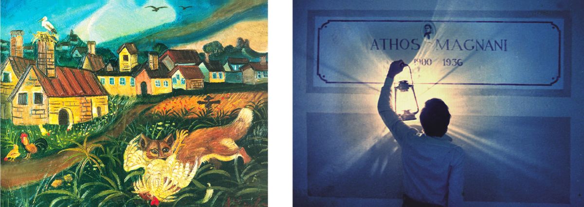
I instead rebelled against a classic education and ventured excitedly into the world of COLOR, though unaware of its various meanings, during the years I studied photography and cinematography. Someone chose to comment: “Reckless … unpredictable figurative ideas, and a NAÏF style at first.” In fact, not having had a traditional education, I discovered naïf painting before classical art. With its bold, primitive colors inspired by nature, and its bright and often contrasting tones, naïf art was my first TEACHER OF COLOR.
At the start of my cinematography career, my first color film with Bernardo Bertolucci was La Strategia Del Ragno, whose images were inspired by René́ Magritte and Antonio Ligabue, a primitivist painter from Parma, Bertolucci’s hometown.
“COLOR has an amazingly variegated, expressive and harmonious vocabulary.”
— Alexander Blok, Russian poet
Then I gradually encountered the great Italian masters, Leonardo, Michelangelo, Caravaggio. In my early films, my chromatic inspirations sprang from emotion, an innate instinct, and being in love with the IMAGE.
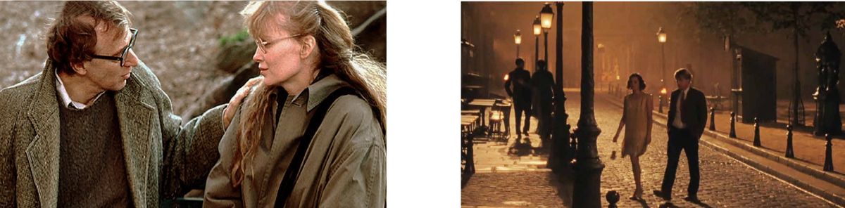
At that time we drew on the cinema of the past: Woody with iconic cinematographers like Gordon Willis [ASC], Carlo Di Palma [AIC], Sven Nykvist [ASC] and Darius Khondji [ASC, AFC], on films like Manhattan, Shadows and Fog, Crimes and Misdemeanors and Midnight in Paris.
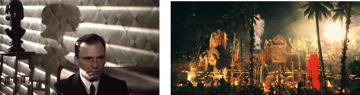
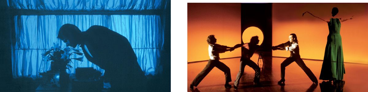
Myself with iconic directors like Bertolucci, Francis Coppola, Warren Beatty and Carlos Saura, with films like Il Conformista, Apocalypse Now, Reds and Flamenco.
So many images that were reminiscent of the figurative culture of the past, that had the feel of the present and enabled us to imagine… images of the future. Then someone invented the digital image, and in the last five years the film industry has virtually changed completely.
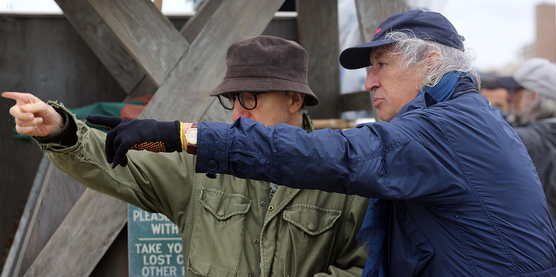
So when Woody asked me to collaborate on Café Society, I read the screenplay, which gave me various figurative ideas for the different stages of the story, based on the works of painters like Georgia O’Keeffe and Tamara de Lempicka in contrast with Otto Dix and Edward Hopper, and arrived ready to embark on a figurative path that was new to both of us. Well aware that progress can be slowed down or speeded up but never stopped, we decided, after having traveled a long path with celluloid, to enter the DIGITAL WORLD together.
Although Woody’s regular collaborators suggested I adopt a SINGLE “WARM” COLOR TONALITY for the whole film, I proposed to him two very different worlds for the Bronx and Hollywood in the 1930s and ’40s, actually dividing the story into four parts and using as many chromatic tonalities to distinguish them — AND HE COMPLETELY AGREED. He immediately loved the idea of DIGITAL and the COLOR VARIATIONS THAT ACCOMPANIED THE STORY in the various stages of its development.
And that’s not all! Although they had assured me that he would never have looked at the monitor during filming, after the very first day and my having explained to him that the image would bear an 80–90% resemblance to the definitive one, he immediately immersed himself in the feelings conveyed by the acting and the figurative image that we were constructing in complete agreement, day by day, right on schedule. In actual fact, digital cinema was not something new for us, but rather a confirmation of the individual paths we had trodden so far.
In previous years, Woody and I had actually worked together on the same projects: New York Stories, but on two different episodes; then Picking up the Pieces, directed by Alfonso Arau, with me as cinematographer and Woody as actor. It was Café Society that finally brought us together in our respective fields: he as screenwriter-director, me as cinematographer.
Woody, with all the nostalgic evocations, the “Amarcord” of his New York in tow; me, with a weighty baggage of images, which were often markedly pictorial since I love the Renaissance and am obsessed with Caravaggio and his constant conflict between light and shade.
Woody, with his monochromatic, desaturated tones; me, with my powerful chromatic emotions deriving from my studies on Isaac Newton, Goethe and so forth, and with the symbolism, dramaturgy and physiology of color.
Initially, I was not so sure that I would be able to visualize one of his films. I have always needed to find a specific style, and personalities who would help me to identify and pursue a specific path of research. I have always thought that no matter what profession we practice, we inevitably seek to identify our expressive possibilities, to come up with answers to our own questions.
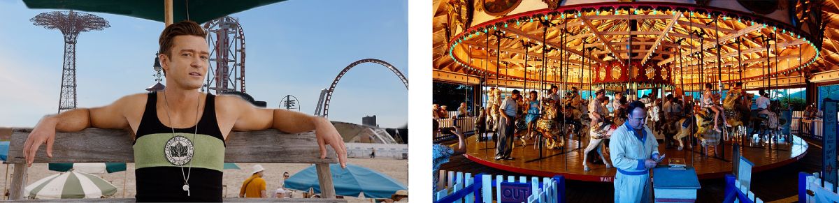
When I read the second script he had prepared, with just the working title “WASP 2016” (Woody Allen Summer Project 2016), I was faced with a story that at first seems tranquil on the surface, but has a variety of conflicts going on underneath. It is a story about an American family set in 1945 on Coney Island, a resort area in Brooklyn, with very long scenes full of dialogue between the various individuals.
In my ignorance I knew nothing about Coney Island, and this left my figurative imagination somewhat at a loss; however, the respect and collaboration I received from Woody on both a professional and human level convinced me that our expressive relationship would continue.
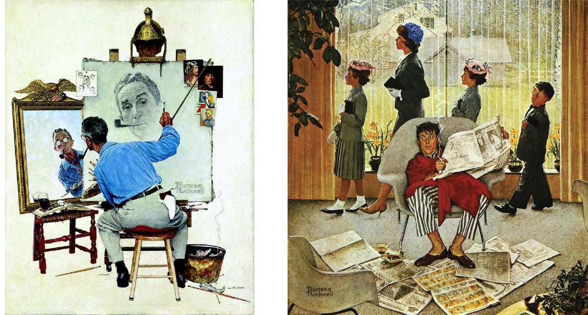
Nonetheless, I was afraid that I would not be able to come up with a pivotal figurative idea for the visual. I confessed all this to Woody, who immediately put my mind at rest by assuring me that we would come up with a specific vision of the film. And then the idea of a superficially serene world in which life’s problems later surface suddenly brought to mind Norman Rockwell’s painting of the postwar period: a vision of life that was all sweetness and light on the outside, but conflicted at its heart.
When I arrived in New York, Woody immediately gave me the necessary support to implement a vision that contrasted outward appearances with what was really happening inside. Then we began the scouts — “we” being myself, Woody, production designer Santo Loquasto and co-producer Helen Robin — and when I discovered Coney Island, I understood its visual potentialities right away.
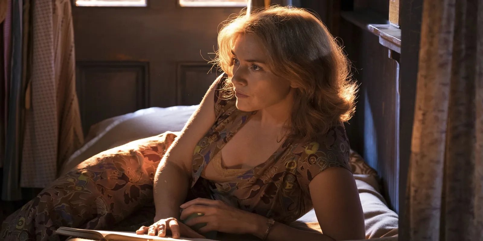
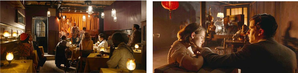
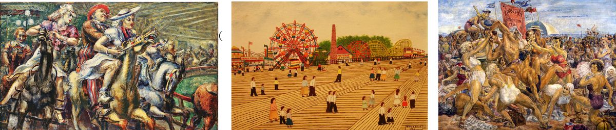
We had an amusement park located on a beach overlooking the Atlantic Ocean, with the protagonist family living right in the middle of the park. The characters in the story — Ginny (Kate Winslet), Mickey (Justin Timberlake), Carolina (Juno Temple) and Humpty (Jim Belushi) — made up a great cast and truly completed the whole picture. They lived with the fantastic world of the amusement park outside their windows, and with their family conflicts inside the apartment. My specific vision for the cinematography was inspired by various painters of the period, especially Reginald Marsh, one of the many who depicted the fantasy of Coney Island.
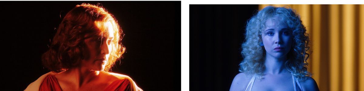
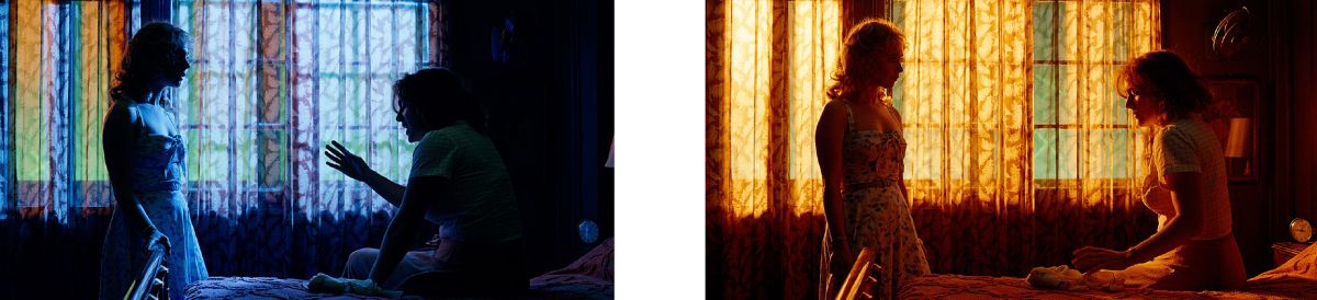
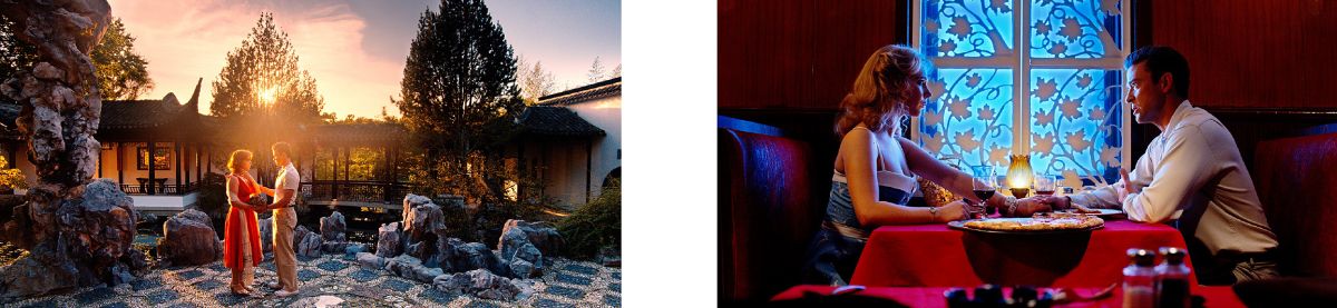
Then I had an even more important idea for visualizing the story while waking up one morning at dawn — something that often happens to me at that preconscious moment. Ginny’s world and that of Carolina, in conflict because they were both in love with Mickey, made me think of applying the “PHYSIOLOGY OF COLOR” theory. Human beings not only receive LIGHT through their eyes, but all over their body. In fact, we are like a sensitive photographic plate, because when visible ENERGY and its COLORS strike our body, they modify our metabolism and blood pressure according to their intensity and chromatic frequency, creating unconscious emotions. Woody immediately saw the visual potential of the story told according to this specific vision, and — NO LONGER AFRAID OF RED, GREEN AND BLUE — he helped, indeed spurred me, to formulate a figurative structure, a cinematography concept that divided the two worlds: fantasy and reality, one with suffused lights, the other with contrasting lights. Ginny’s world, experienced through the warm tonalities of an ORANGE SUNSET, and Carolina’s world, experienced through the cold tonalities of a BLUE DUSK.
This is how we created a palette of LIGHTS and COLORS that accentuated the variations in the dialogue by reflecting the characters’ emotions.
When I shared my theories with production designer Santo Loquasto and costume designer Suzy Benzinger, in full agreement we started to create a specific vision of the film together. This is what should always happen: each film should have a special vision, in keeping with a particular story.
RED has represented our existential dawn since human life began. When we awake it is the first Color that impinges on our Consciousness. Symbol of vital energy, it is Male, and increases blood flow, muscular tension, and pulse rate. It signals the Positive, and is the flame of the human spirit. It is the Color of the PAST.
So with the help of different scenographic and costume elements; with various filters in front of the Cooke S4 lenses on the two Sony F65 4K 16-bit color digital cameras that had been prepared for image composition with an aspect ratio of 2:1 at Panavision by Chris Konash and Steve Wills; with assistants Bobby Mancuso and Beka Venezia; with Rosco gels on the projectors provided by Cinelease and Iride controlled by the lighting console; with the collaboration of gaffer Steve Ramsey and key grip Bill Weberg; and especially through using the natural light of the afternoon/sunset and dusk/evening, and dividing the spectrum into two different emotive tonalities — I was able to WRITE WITH LIGHT the story of Wonder Wheel.
Thanks to Isaac Newton’s science and Johann Wolfgang von Goethe’s Theory of Colors, and their palette of RED–ORANGE–YELLOW–GREEN–BLUE–INDIGO–VIOLET, I had the “seven” colors at my disposal — but I used the LANGUAGE OF COLORS, basically extracting only two, orange and blue, which, although often in conflict with each other, best helped me to visually recount the feelings and emotions of the various protagonists of this story that starts out as a comedy but takes on increasingly dramatic tones, and certainly enhanced the different moods of the film.
No one should be afraid of color. We have to get to know it and its expressive potentialities. By creating harmony or conflict between the three primary colors red/green/blue, and their three complementary colors cyan/magenta/yellow, we can convey visual emotions to the audience, in the same way that words convey emotions in literature, and notes in music. I think a knowledge of the symbolism, dramaturgy and physiology of color is fundamental, particularly in the digital age. It allows us to use color with greater awareness in the visual arts, and especially in cinema.
Today, the cinematic image no longer has the mystery it once had, and a knowledge of the meanings of LIGHT and COLORS is both indispensable and essential to intuit, to suggest, to create and, if necessary, to modify the COLOR IMAGES THAT THE MONITOR SHOWS US ON THE SET — IN FRONT OF EVERYONE.
In digital cinema, the arrival of the HDR (High Dynamic Range) system that offers enhanced color saturation and produces bright, high-contrast, color-saturated images suitable for action movies and spectacular special effects, may lead us to believe — as in the 1950s — that this kind of vision is not appropriate for films about human feelings or for dramatic stories. To satisfy the vast young public, HDR images will be requested for all films. But this will not be a problem, even for the most creative movies, as long as we are familiar with the meanings and symbols of the language of color. Indeed, it could be a great help if we use the dramaturgy of color “with awareness,” like the great Russian director Sergei Eisenstein advised us to in the chapter “Color and Meaning” of his book The Film Sense. I know that Amazon Studios will request the HDR version of Wonder Wheel, and I will be happy to prepare it, because it will be in line with the vision of the story.
GREEN represents protection from the dangers of the outside world. Its inner vitality indicates peace. Positioned in the middle of the spectrum, it links the two worlds of Beginning and End, of Light and Darkness. It divides materiality from the destiny of spirituality. It is the Color of the Soul, and represents Knowledge.
The composition and rhythm of the images captured by the digital cameras guided by operator Will Arnot, the quality controls carried out by DIT Simone D’Arcangelo, and the close examination of those images for the rushes by colorist Anthony Raffaele at Techniclor-PostWorks in New York, were certainly fundamental for me in envisaging, creating and perfecting the figurative quality of the film during the entire period of preparation and production. The latter was actually very fast: 30 days of shooting. With the digital-intermediate session, which also took place at Technicolor with Anthony Raffaele, and with the confirmation of some additional images outside the windows of the family’s apartment
by the visual-effects department of Brainstorm and visual-effects supervisors Rich Friedlander and Eran Dinur, the visual work in harmony with the dramaturgy of Woody’s original screenplay was completed.
When every aspect of a film, from its conception to its realization and postproduction, melds so perfectly, and the various protagonists and co-authors are in harmony and well-directed by the director, that film has all the ingredients for conveying its story to the audience as effectively as possible. Indeed, I believe that today’s SENSOR and the film stock that came before it have always been and will always be more sensitive than technicians tell us. They are actually able to capture the EMOTIONS OF THE WHOLE CREW THAT PARTICIPATES IN MAKING A FILM. And when this is done in CREATIVE HARMONY, there is a probability that the film will turn out well — THAT IT WILL BE A GOOD FILM.
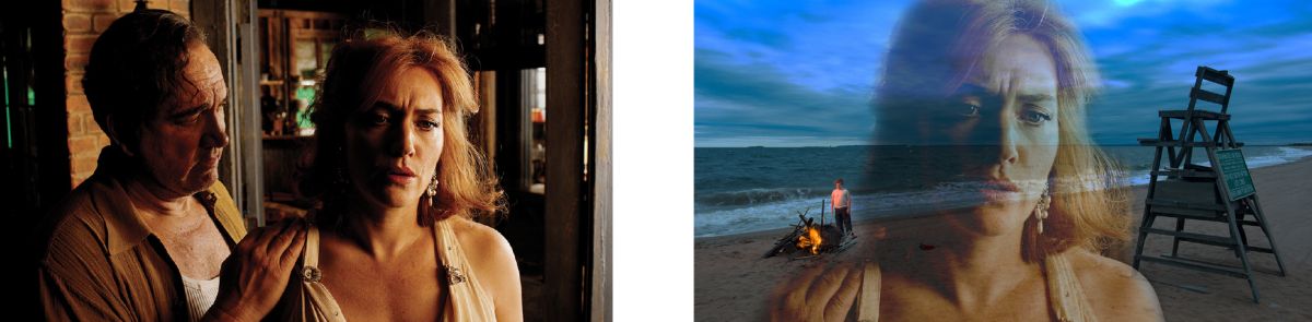
BLUE is the color of thought and intuition; it is conducive to keen intelligence. Of a spiritual nature, it has something superior to the human being itself; it represents awareness, its sensory perception is Gentleness, its emotive content, Tenderness. Psychologically speaking, it increases a tendency toward Sensibility, its movement is Centrifugal, it tends to recede from the eye. Blue is the color of INTELLIGENCE and the FUTURE.
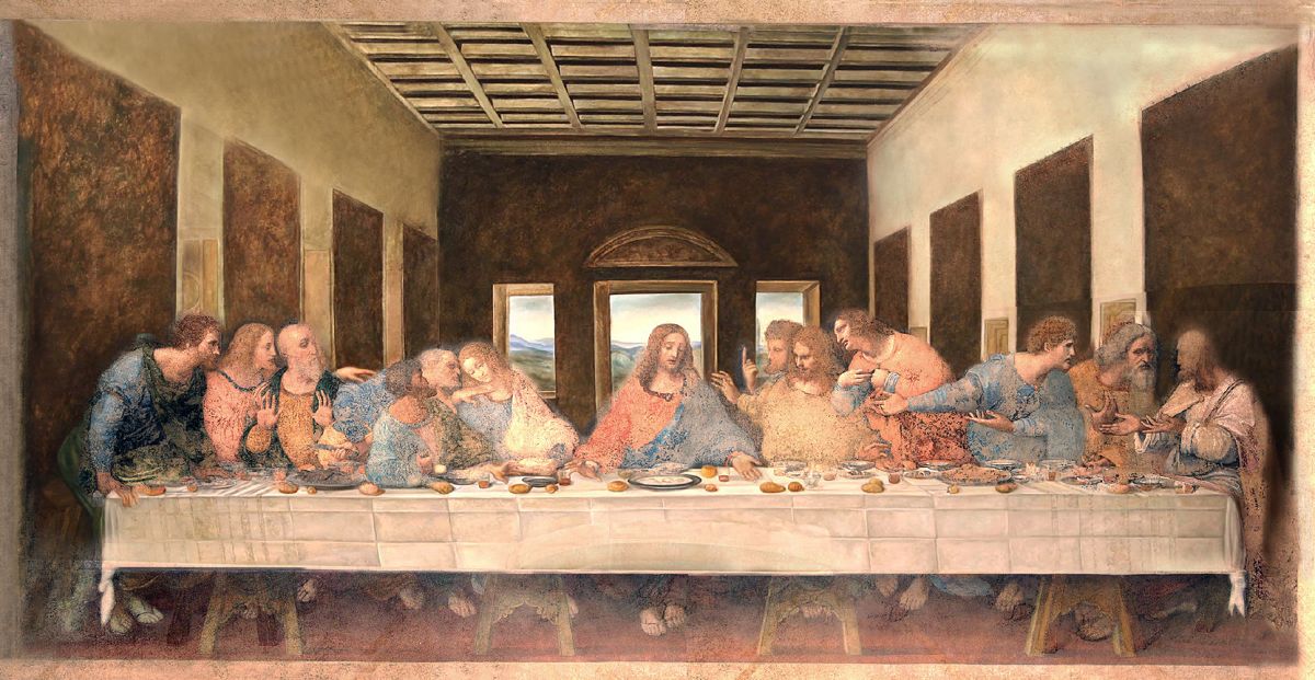
All of this, I think should be enclosed into an Image composition really in Equilibrium. Since long time I do not believe any more that the various film formats, invented to capture the audience attention from several film companies, are still valid at present time. Leonardo da Vinci, with his Genius, indicated since 1498 the best composition of visual arts, with his fresco “The Last Supper” in 2:1 aspect ratio — certainly the best poster of the Italian Renaissance.
Leonardo da Vinci says: “A good painter should paint two principal things: the man and the concept of his own mind.”
While we were wrapping the film, I heard someone say: “If Woody and Vittorio have a bit of a future together, who knows what THOSE TWO will do next!”