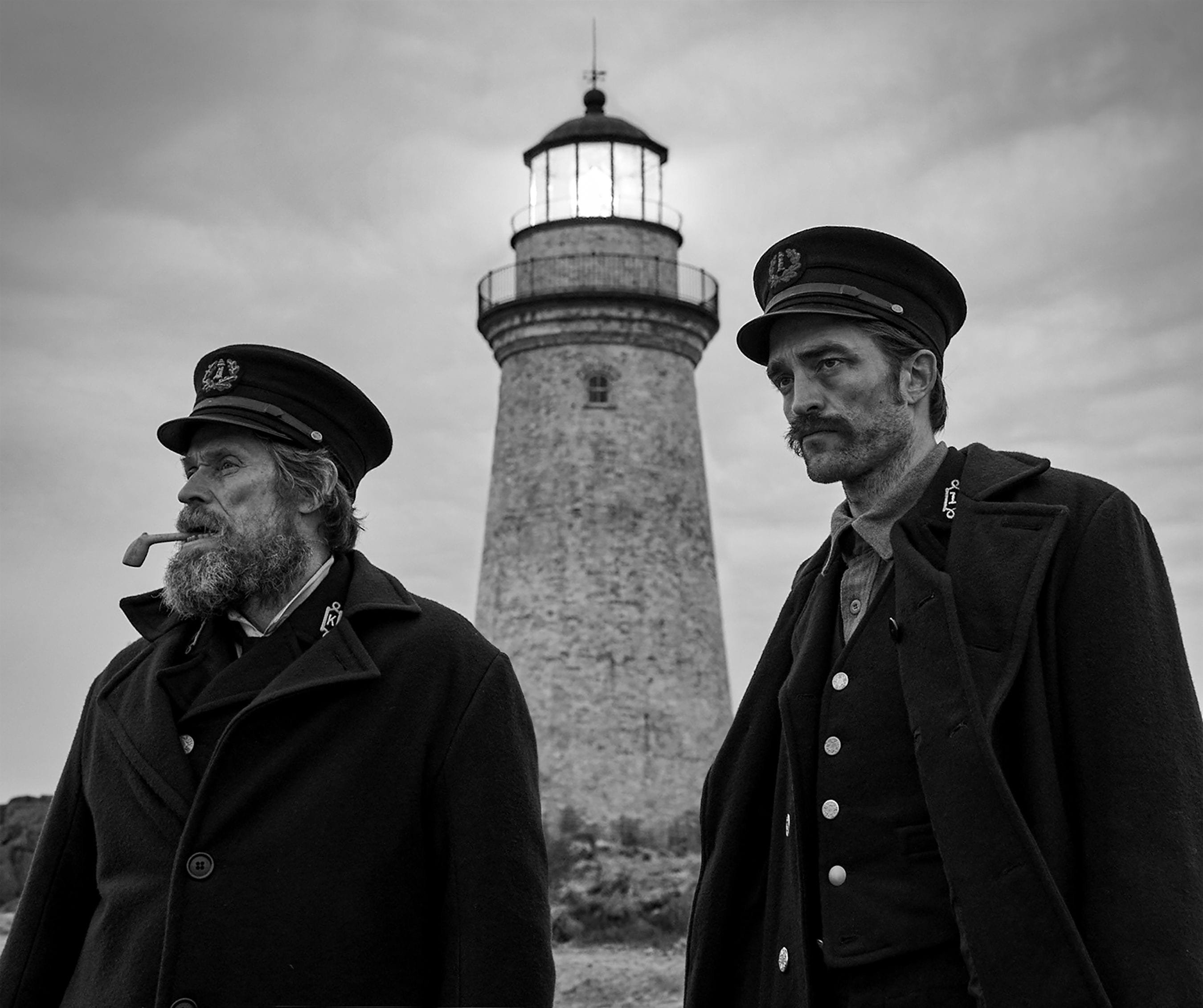
Stormy Isle: The Lighthouse
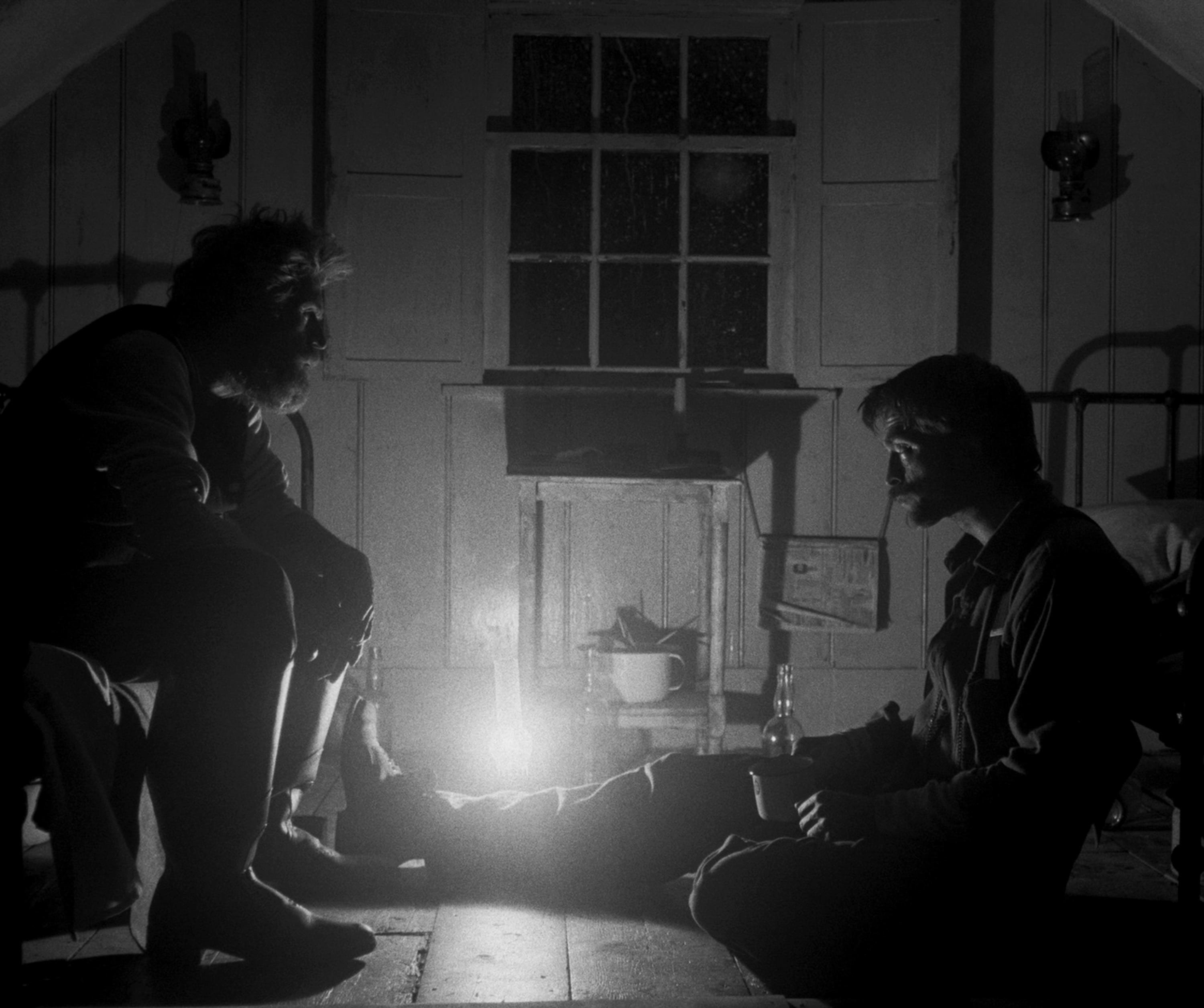
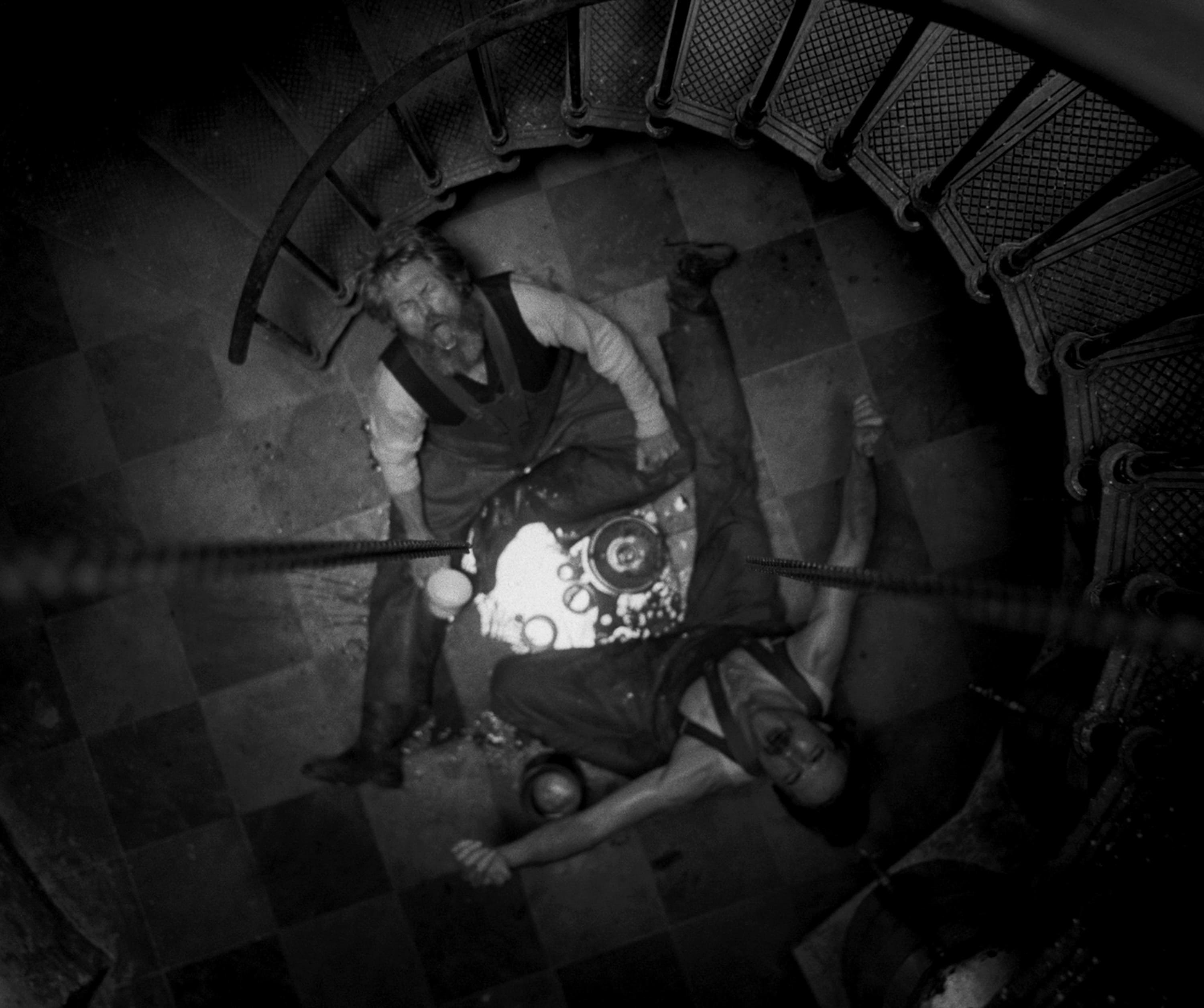
Cinematographer Jarin Blaschke shoots with black-and-white negative, vintage lenses and custom filters to emulate the orthochromatic film stock of old.

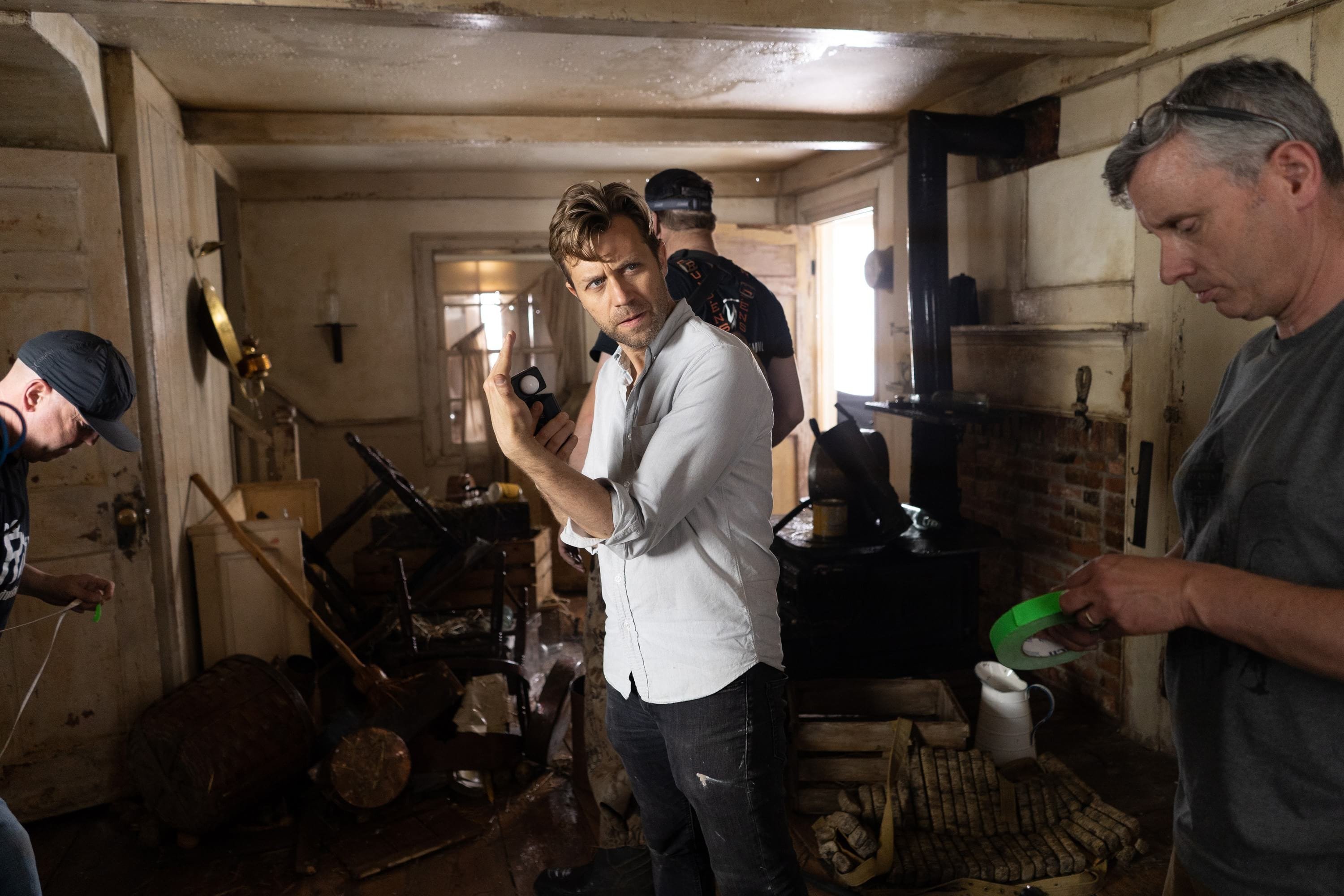
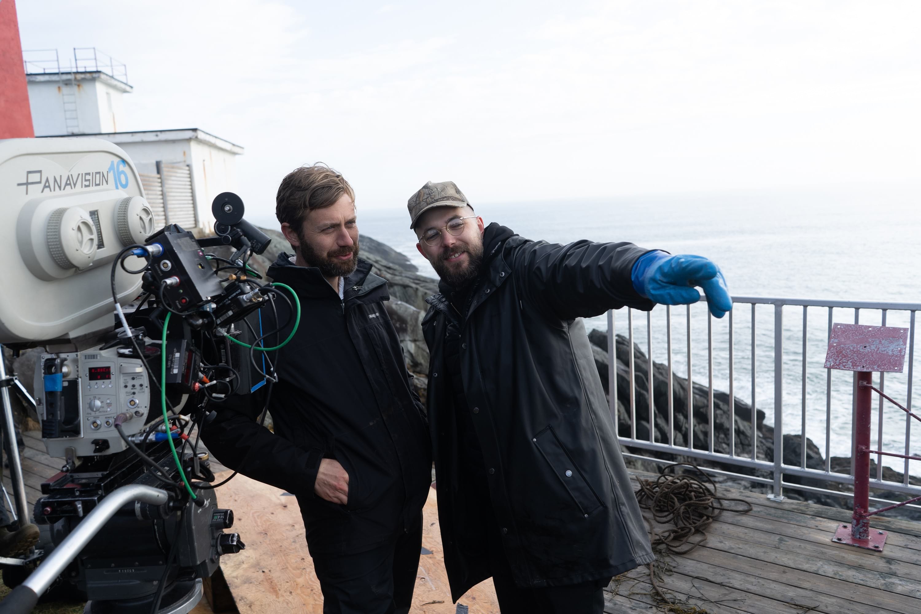
Unit photography by Chris Reardon. All images courtesy of A24
Three years after transporting audiences back to colonial New England with The Witch (AC March ’16), writer-director Robert Eggers and cinematographer Jarin Blaschke reteamed for their second feature collaboration, The Lighthouse.
The year is 1890, the place a remote island off the New England coast. Two lighthouse keepers arrive for a four-week stint. One is a crusty old captain (Willem Dafoe), the other a former lumberjack haunted by his past (Robert Pattinson). As a seemingly endless storm batters the island, the men’s contest of wills is no less destructive. Mythic creatures and dead sailors’ souls also play a part, as in the best salty-sea yarns.
Blaschke created a look as unique as the story. The cinematographer shot on Kodak’s Eastman Double-X black-and-white 5222 film stock with a Panavision Millennium XL2 and 1930s-'40s Baltar lenses, and he also used custom filters that emulated early-1900s orthochromatic stock, which was sensitive to ultraviolet, blue and green light, but not red.
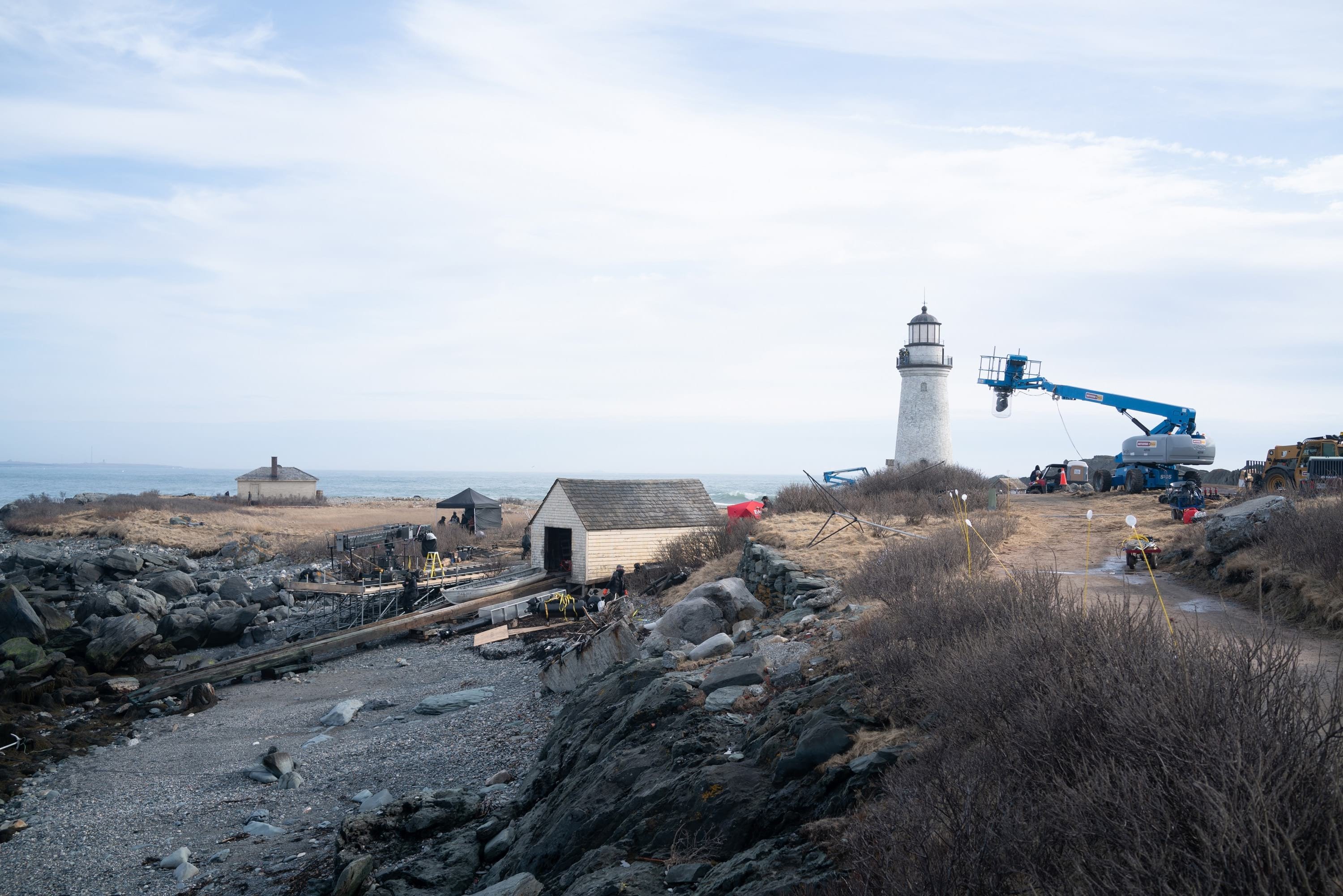
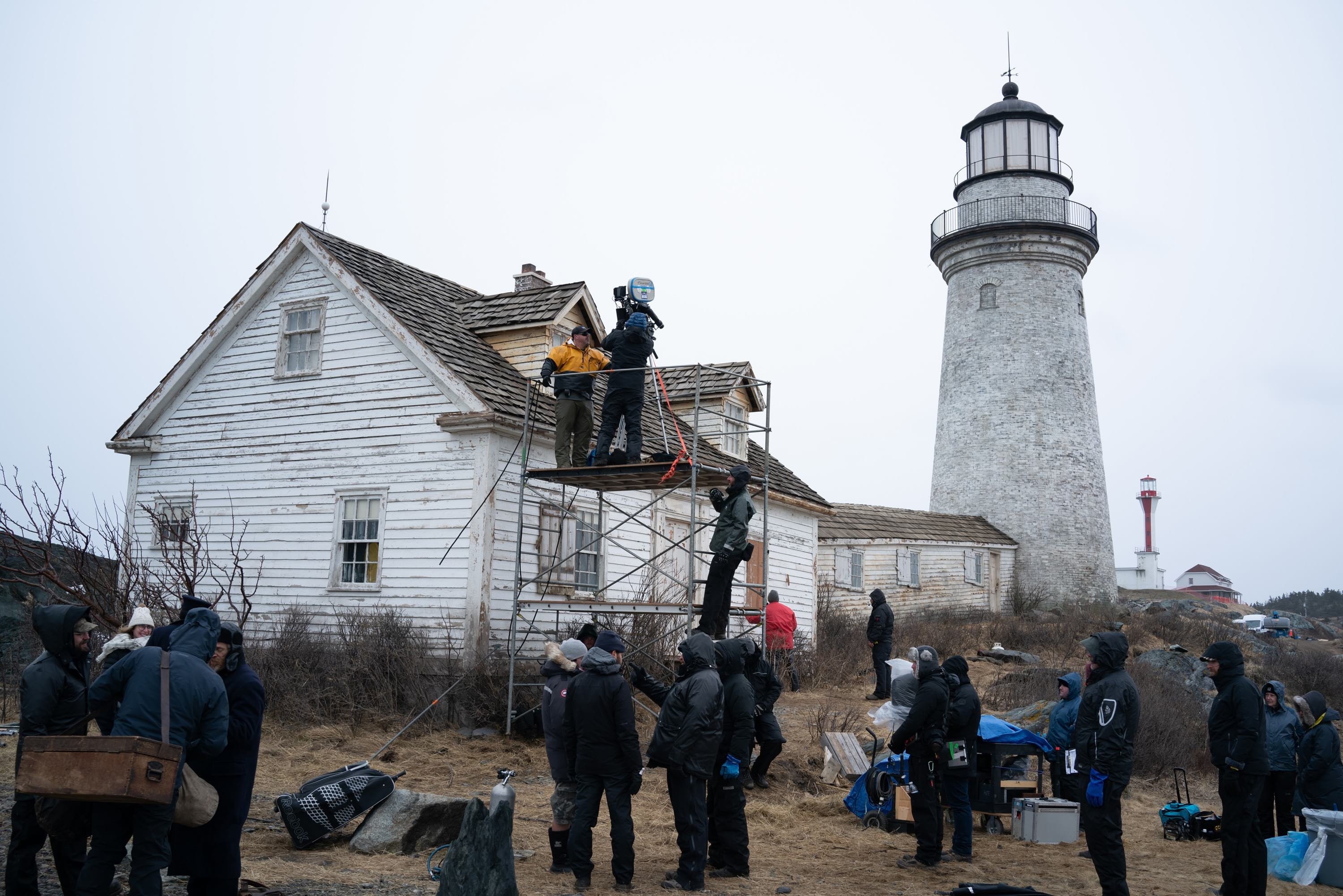
Conceived before The Witch got off the ground, this two-hander, single-camera production was shot over 35 days on Cape Forchu — a rocky peninsula near Yarmouth, Nova Scotia — and in a couple of warehouse stages near Halifax. The location-built sets included a period-accurate lighthouse with working Fresnel lens, which withstood three nor’easters, as did cast and crew.
American Cinematographer: On page one of his earliest drafts, Robert Eggers wrote that The Lighthouse was to be shot on 35mm black-and-white. Why was this important?
Jarin Blaschke: Years ago, when Rob first teased the idea for The Lighthouse across his kitchen table, all I knew was that it was going to be two men, a tight space, a tight aspect ratio, madness, occasional flatulence, and ‘black-and-white with a cherry on top.’ I took that to mean he wanted to be unapologetically old-fashioned and to transport the audience to another world. Black-and-white is good for that. It’s instantly abstract.
Why not shoot color, and then change it in post?
Early on, while The Witch was stalling, The Lighthouse could have potentially been Rob’s first film. We didn’t know what the budget would be. At one point, Rob asked if I thought a digital format could work for the black-and-white look he was after. As a longtime shooter of black-and-white still film, I didn’t think it would, since black-and-white film has a very particular texture; there are three-dimensional chunks of silver embedded in gelatin at different depths and sizes. It’s much more physical than even a color film image, which is made of tiny clouds of dye. For The Lighthouse, I performed some simple tests to address my suspicions. I shot 35mm Double-X, 35mm color film [5219], and with the Arri Alexa. Our assumptions were upheld. In addition to much larger grain, the Double-X had more ‘tooth.’ Even if you match the overall contrast in the DI, the Double-X had more ‘local’ or ‘micro’ contrast, which emphasizes texture and better differentiates similar tones.
Did you have any trouble finding a facility to process Double-X?
There’s a smattering of labs across eastern North America that can develop black-and-white, but in the end, FotoKem was the only place that could deliver the quality, consistency and cleanliness needed for a film like this. Production agreed strongly enough to pay for film shipping from Nova Scotia to Burbank [Calif.] every day.
What kind of dailies did you have?
We had online links to dailies as soon as they were available, about a week after they were shot. If I wanted to get a better idea of focus accuracy, the performance of a lens, or even my exposure, I’d have to wait a couple additional days to watch ProRes files in the editing room. All were derived from the initial 4K master scan. After all those compressed references, grading the film a year later was a revelation. [The final grade was performed digitally by Joe Gawler at Harbor Picture Company in New York.]
“He added 1.19:1 as another requirement alongside ‘35mm black-and-white film’ on page one of the script. I never heard of any pushback from the producers or distributors about the aspect ratio, unlike the black-and-white origination.”
Why the 1.19:1 aspect ratio?
Rob is preoccupied with the past. His taste in art is similar to his taste in literature — it tends to end before the 20th century. I’ve been trying to get him to read Hemingway for years. He sees things in a non-widescreen way. The first two shorts we did together were 1.33, which he loves. The Witch was 1.66, which was the boxiest aspect ratio we thought we could get away with for Rob’s first feature and still get distribution. The Lighthouse was intended to be 1.33, but sometime during its writing, I brought up 1.19, mostly as a joke, but with a curious eye toward his response. After brief consideration, he took to it wholeheartedly. He added 1.19:1 as another requirement alongside ‘35mm black-and-white film’ on page one of the script. I never heard of any pushback from the producers or distributors about the aspect ratio, unlike the black-and-white origination. I’ve been practicing still photography for 25 years, much of it in black-and-white, processing and printing it all myself. I started with 35mm, then moved to 6-by-6cm and some 6-by-4.5cm, back to 35mm after I was robbed of some cameras, then 6-by-7cm, and now 8-by-10-inch film. It was sometime in the square-format years when I finally began to make some good pictures. I found the square and a moderately wide lens to be a very effective portrait format. It was the perfect balance between person and environment. This made me completely confident in suggesting 1.19 for The Lighthouse. It frames the vertical lighthouse even better, isolates our two characters even more, and truly traps them together when they do share a frame. This film is more of a close-up movie than The Witch, and 1.19 simplifies and focuses on these details in a beautifully direct way.
You experienced pushback about the black-and-white origination?
About a month before pre-production, all [key personnel] and department heads had a very warm gathering to meet and greet, and to start to think about how to make this movie. There was a pocket of time spent, however, on trying to convince Rob and me to shoot color for black-and-white, because they could sell the film to more territories. This was an appalling idea to Rob because there would be an obscure color version of the film somewhere in South America or the South Seas or someplace, and appalling to me because it would compromise the intended black-and-white version. An exceptionally prominent producer, [with] decades of blockbuster films behind him, bore into little ol’ me and asked, ‘With all of today’s amazing technology, you’re seriously telling me there’s no other way to get the look?’ I just had to calmly look him in the eyes and say, ‘…no.’ Of course, this was a month before our tests could back up anything, and I was simply bolstering dumb instinct at that point. It’s a testament to the trust given us that the conversation then petered out, and that we ended up shooting the film on black-and-white film stock.
What references did Eggers have in mind?
A bit of Béla Tarr for tonal dreariness and patient use of camera. Bergman’s camera language, as always. [Eggers] liked the strong night lighting of In Cold Blood. There were some nautical silent films, including Flaherty’s Man of Aran, [which was shot] on orthochromatic stock with strong, direct close-ups. [The influence of] Eisenstein was there for montage, and bold, hard cuts. Optically, the films we watched from the ’20s and ’30s were very appealing in their subtle fringe distortions and the way highlights would shimmer. In the end, the most influential references were M — an inspirational and modern film, in terms of visual language — and Bresson’s Pickpocket, which influenced [our] use of close-ups, especially actions with hands. These helped steer The Lighthouse away from the purist photographic confines of the turn of the century, and more toward early modernism.
“After The Witch, I had a sturdy foundational knowledge of vintage lenses. However, because of our film’s era, the black-and-white, and the camera style, The Lighthouse was going to be more ‘photographic.’”
You shot with vintage Bausch & Lomb Baltar lenses. What made those the right choice?
After The Witch, I had a sturdy foundational knowledge of vintage lenses. However, because of our film’s era, the black-and-white, and the camera style, The Lighthouse was going to be more ‘photographic.’ I wanted more of an optical footprint, for the lenses to have some say in how we experience the period and the light. My first test was to explore vintage lenses outside my familiar Super Baltars, Kowas, Cooke Panchros, and Panavision high speeds. I wanted to see how much optical character we could introduce before things moved from transportive to kitschy. I asked Panavision for some ‘off-menu’ vintage lenses to look at. The technician introduced some Cooke Series 1s; a detuned ‘mystery’ modern lens; a rehoused, uncoated 1905 triplet; and the Baltars. I told him I was very familiar with the Super Baltars, but he said, ‘These aren’t Super Baltars, these are Baltars.’ They were designed in the 1930s, and our serial numbers dated between 1941 and 1944. They pass a lot of blue and ultraviolet light, which was great for our orthochromatic look. I found them to be the most glowing, beautiful portrait lenses I’d ever seen, stopping short of getting too soft or flarey. They had even more bokeh character than the Cooke Series 1s, and less contrast. Their most beautiful feature is how highlights glow and shimmer. Their smoothing character could balance out the micro-contrast of the Double-X and the orthochromatic filter. I had to shoot a thorough test of all the lenses to find when a bright source haloed too much. In the case of a bright window, I found the limit to be a reflective plus-6 stops.
Were there other lenses as well?
We had the slow, uncoated 50mm [T3.5] triplet design from 1905. Before [Panavision vice president of optical engineering and ASC associate] Dan Sasaki rehoused it, it was made of brass and was the size of a thimble. We used this for a couple flashback images. Our most unusual lenses were three Petzval designs made by Dan Sasaki. It’s a lens type that goes back to 1840. A Petzval lens swirls out-of-focus backgrounds in a distinct way, and the effect gets very heavy toward the edges. This is not a subtle look; we used them only for heightened moments and flashbacks. Dan had a 58mm and an 85mm already made. As I use a 35mm focal length a lot, I asked him about making a 35mm, and he did!
Tell us about the orthochromatic look used in The Lighthouse.
For the first decades of photography, we could only record ultraviolet and blue light. This is why 19th-century photographs display such bright, blank skies and dark skin tones — skies carry a lot of blue light, while skin tones reflect mostly red light with some green. Photographic plates were not made sensitive to green light until the 1870s. Emulsions that were sensitive to blue and green [and ultraviolet] light were then designated ‘orthochromatic.’ We now could record two out of three of our primary colors, but skin tones would still record rather darkly, and clouds would not separate strongly against a blue sky. Also, variations in red/orange tones were exaggerated, so blemishes and textures on a face were emphasized. This look not only evokes a bygone time, but further weathers the appearance of our salty, beaten-down characters in The Lighthouse. Interestingly, well into the 1950s, orthochromatic film remained popular for portraitists who photographed male subjects. It would make them look further bronzed and rustic. The famous Karsh photograph of Ernest Hemingway is a textbook example.
Tell us about the filter you created with Schneider Optics to emulate orthochromatic stock.
At first I tried to achieve the ortho look through conventional color correction and black-and-white filters. These included strong CC cyan filters, tungsten-to-daylight correction filters, and then the stronger 47 Blue and 58 Green filters. The problem was that the CC filters were much too subtle. Conversely, the 47 and 58 filters were very effective indeed, but they cost 3 to 4 stops of light. If Double-X is 200 ISO, that would mean shooting at 12 to 25 ISO with those filters — and even slower in tungsten situations — which is utterly impractical for all but day-exterior scenes. Furthermore, you can’t operate through the eyepiece with a nearly opaque 47 filter. Eventually, Mike Carter at Panavision connected me with Ron Engvaldsen at Schneider Optics. I was amazed — Ron was willing to make a custom filter to my specifications. I sketched a desired spectrograph on graph paper, indicating a complete elimination of all light beyond 570 nanometers [mid-yellow] while allowing all shorter wavelengths to pass freely. At that point, I was unsure of the true light loss and I was pretty nervous about it. This was not a cheap experiment for Panavision. Schneider needed a month to manufacture the filter in 4-by-5.6 and 6-by-6 sizes, so in the meantime [as a test] we tried a theoretically similar, obscure 46mm laboratory short-pass filter to examine its ortho effect and light cost. Taping the 46mm SP filter within the concave front of our Baltar lenses, tests showed that it gave a stronger effect than 58 Green, and nearly as strong an effect as the 47 Blue. At the same time, the overall light loss was only 5⁄6 of a stop in daylight/HMI and 12⁄3 stops for tungsten. Success!
“I am annoyingly specific with placement of marks and composition, but I only would operate a few very simple shots. After the marks and frames are conveyed, I let my very good operator do the acrobatics.”
Who operated camera?
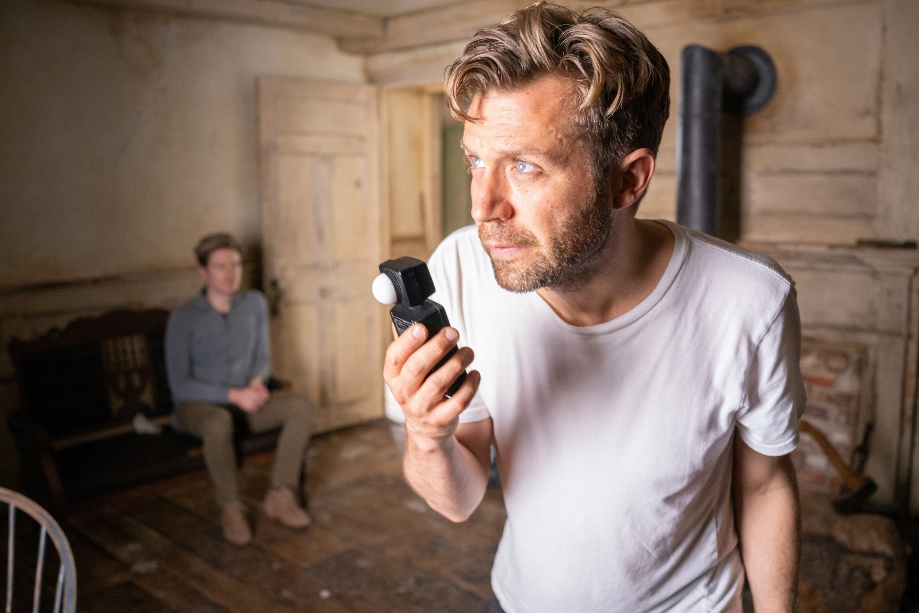
I am annoyingly specific with placement of marks and composition, but I only would operate a few very simple shots. After the marks and frames are conveyed, I let my very good operator do the acrobatics. In this case, that was Christopher Ball. And we were uncannily lucky to find available the best and most experienced 1st AC for film in Nova Scotia, and quite possibly Canada, Eddy McInnis. He both hated and relished our ancient lenses.
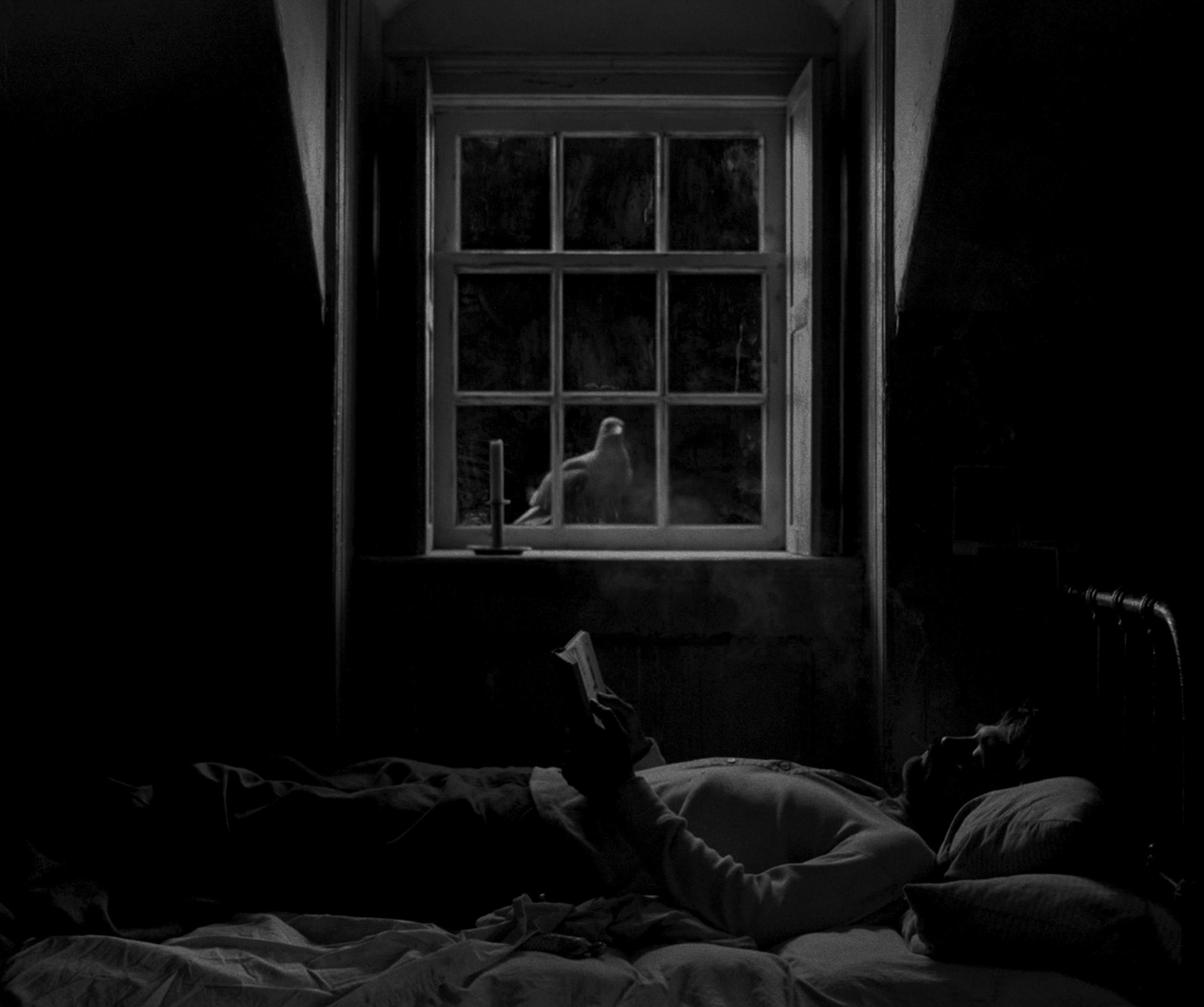
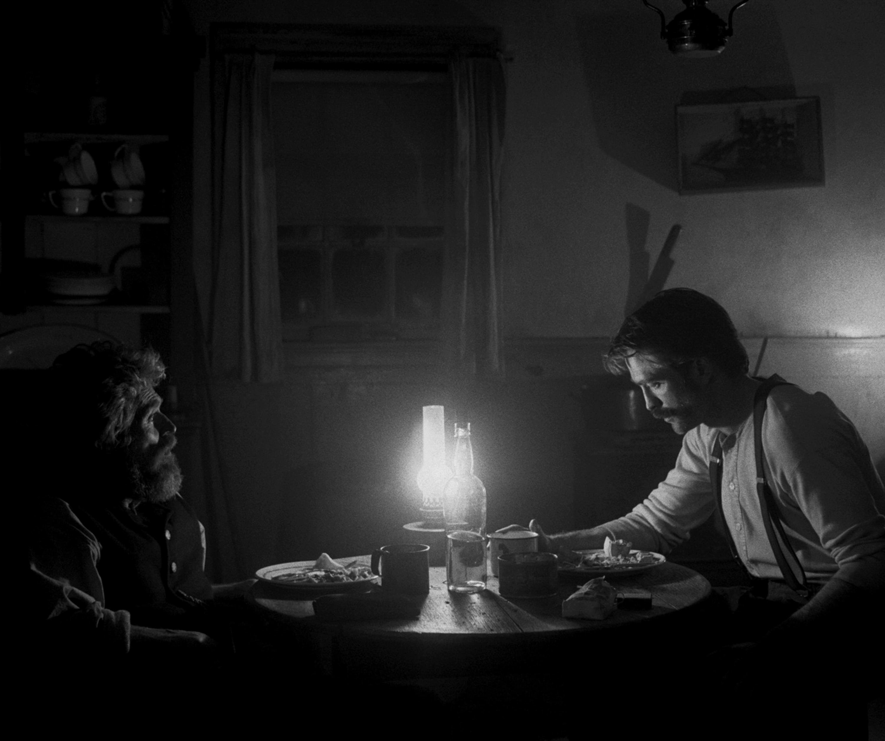
Many night interiors occur in the lighthouse kitchen, where there’s harsh lantern light that falls off quickly to pitch-black shadow. How did you light those scenes?
I am somewhat naturalistic, so if there’s a lantern on the table, I just put a lantern on the table. If I supplement it, it’s all coming from that direction. So that was just an 800-watt halogen bulb inside of a lantern. With the filter, it took our photography down to 50 ASA. It was extremely bright on set. Everyone was seeing spots. The first several weeks, it was just a bare bulb, and I would net it off, so it would fall off even faster. After a week or two, I started putting a small China lantern directly behind it, just to enrich it ever so slightly. The lantern light also falls off so quickly in our movie because Double-X has about 11⁄2 stops less shadow latitude than color stock.
For day interiors, we heard you had quite a bit of lighting.
What feels most natural to me for day interiors is bounce light, so I’ll just surround all the windows with white muslin and make a cyclorama, basically. Our filter was more sensitive to HMIs than halogen bulbs, so we got a whopping 80 ASA for day interiors — while night interiors were tungsten, and thus 50 ASA. Our lenses needed 2.8; less than that and they’d fall apart. So outside a window we’d have two M90s, plus up to two traditional 18Ks bouncing into that muslin. We’re not accustomed to light levels like that anymore.
You’ve worked with Rob Eggers since his 2008 short The Tell-Tale Heart. You call him your ‘enabler.’
I knew I had an ally in my insanity. With Rob, it was okay to be a perfectionist, celebrated even. Finally, it wasn’t like, ‘This looks great, but can you just make it a little less good?’ — which is kind of what you’re asked all the time in indie film. We push each other. We get each other. It’s a dream come true.
TECH SPECS 1.19:1
4-perf 35mm
Panavision Millennium XL2
Bausch & Lomb Baltar, Petzval
Kodak Eastman Double-X 5222 Black & White Negative Film
Digital Grade
Burning Bright
“The shimmering jewel of a 19th-century lighthouse is its spinning lens,” says cinematographer Jarin Blaschke. In The Lighthouse, it’s both a functioning beam and something more mysterious, casting its spell over both lighthouse keepers. It was essential to get it right.
To study the characteristics of a turn-of-the-century Fresnel lens, Blaschke and director Robert Eggers visited a 1909 lighthouse on Point Cabrillo in Northern California. A lens was then custom-built for the production. It was eight-sided — “like an octopus,” the cinematographer says — acrylic, and weighed 1,200 pounds. “I heard it cost $100,000. But if it had been made of glass, it would have been $1 million,” Blaschke notes. Key grip Craig Stewart built a turntable that also raised and lowered, while gaffer Ken LeBlanc plucked bulb and base from a dismantled 6K HMI.
“Initially, the lens was just supposed to be on set,” Blaschke notes. “We didn’t think we could actually bring that heavy, heavy lens up 70 feet into the location lantern. But, last-minute, they did. Expectations were always exceeded. We were not expecting to build the whole lighthouse, but rather to build segments or a CGI top. Nor [were we expecting to] be able to boom up the whole thing. But it all happened.”
“The [lighthouse] Fresnels were designed to be used with an oil flame, until incandescent bulbs came along and the oil and wick were replaced,” Blaschke explains. “The Fresnel lenses themselves were gradually replaced by simple clamshell lenses. Whenever I visited a working lighthouse, Fresnel or otherwise, it would have a puny household bulb in it — kind of amazing.” Now imagine swapping that with a 6K HMI — necessary for the beam to be shapely and distinct on film. The day they switched it on, “it was pretty magical,” Blaschke recalls. And shocking to fishermen. “We were getting calls from out at sea,” where the beam extended 12 nautical miles.
Scenes inside the lantern room had actors positioned in close proximity to the lamp, and even with safety glass, a 6K was deemed too hazardous, so these shots were filmed onstage with a 2K tungsten bulb. “All interiors in the lantern room and adjacent machine room were shot on a Halifax stage,” the cinematographer notes. “The location lighthouse could only be used for exterior shots.” The one exception was a sequence involving Willem Dafoe’s character, Thomas Wake, who forbids Robert Pattinson’s Ephraim Winslow from entering the lighthouse lantern room without explaining why. One night when Ephraim is outside, he looks up and sees Thomas standing before the light, stark naked and transfixed. That wide shot required putting Dafoe in the replica lighthouse.
“There’s Willem with a sock on his genitals, slathered in sun lotion on a freezing night in front of a Fresnel lens in a lighthouse made of fricking scaffolding,” Blaschke says. “There was definitely some unusual stuff going on.”
Being four hours from Halifax, Cape Forchu required a DIY mentality. “We were very far from support, so everything had to be built,” Stewart says. “If you needed something, it wasn’t getting there that day.” Among the key grip’s creations was a homemade cable-cam rig that ascended the entirety of the 70' lighthouse.
“The initial plan was to use a crane for the whole tower,” Blaschke says, “but we were told somewhat late that a 100-foot Technocrane could not be sourced, as it was being used in Vancouver — and transportation of the Techno was prohibitively expensive, anyway. This, then, put us in a very bad position of having to stitch together two shots that were probably not going to match. That is, until Craig solved it with his cable rig.”
Stewart’s other handiwork included a 40' pier, sturdy enough to resist tides for two weeks and hold a 50' Technocrane. One scene that employed this setting was Ephraim’s first dream-like sighting of a mermaid. The sea is calm, and moonlight glitters on the water and reflects onto Ephraim’s face in a bright, almost supernatural way. Something catches his eye, and he walks into the ocean. Submerged, he sees a mermaid swimming toward him.
Moonlight was created from 500' across the bay, where two Arrimaxes perched on a 125' crane. For the reverse on Pattinson, “We put our stabilized head on the Technocrane and operated it remotely,” Stewart recalls. With a fully extended arm, “we could swing over the ocean and get right down to the waves without submerging the camera.” The light of a 2K open-face Blonde, which was placed just above camera and powered with the aid of a Variac variable transformer, bounced off the rippling water. After Pattinson submerges, the shot transitioned to an indoor pool near Halifax — but everything before that had to be scheduled around the tides, requiring three sessions to complete. Blaschke attests, “That was tricky to get.”