Pleasantville: Black and White in Color
This comedic fantasy provides a unique opportunity for the digital and photochemical production worlds to momentarily merge.

By Bob Fisher
Unit photography by Ralph Nelson
Writer-Director Gary Ross can’t tell you precisely where he got the idea for the feature film Pleasantville, but it hatched in the back of his mind about six years ago. It took three years for the concept to take shape, a year to outline the script, and another three months to write it. The result is a black-and-white fairy tale that employs the gradual use of vivid color in many scenes to illustrate the personal and emotional growth of the film’s characters.
Ross ventured into unexplored territory by making a hybrid movie. Some 163,000 frames of 35mm film were digitized for the purpose of removing most colors and manipulating others. This type of image conversion and manipulation has been routinely done in commercials, but never before in a live-action, feature-length film.
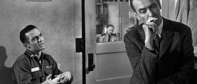
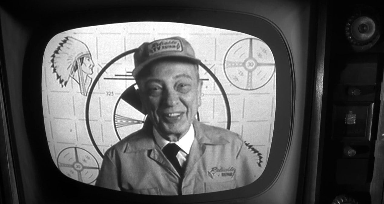
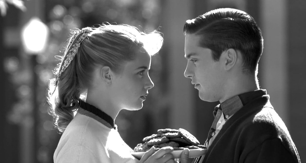
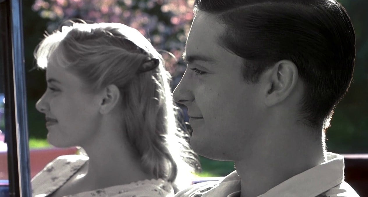
Ross describes himself as a contemporary fabler and has earned Oscar nominations for scripting the comedies Big and Dave, but Pleasantville is his first outing as a director. The central characters in the picture are David (Tobey Maguire) and Jennifer (Reese Witherspoon), twin teenagers living in 1990s suburbia. David is addicted to reruns of 1950s TV shows, and his favorite program is entitled Pleasantville, whose prototype could be Ozzie and Harriet. Later in the story, a peculiar TV repairman (Don Knotts) gives David a remote control that magically zaps the twins into the black-and-white world of Pleasantville, where they have ready-made parents, the Parkers (Joan Allen and William H. Macy).
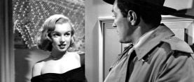
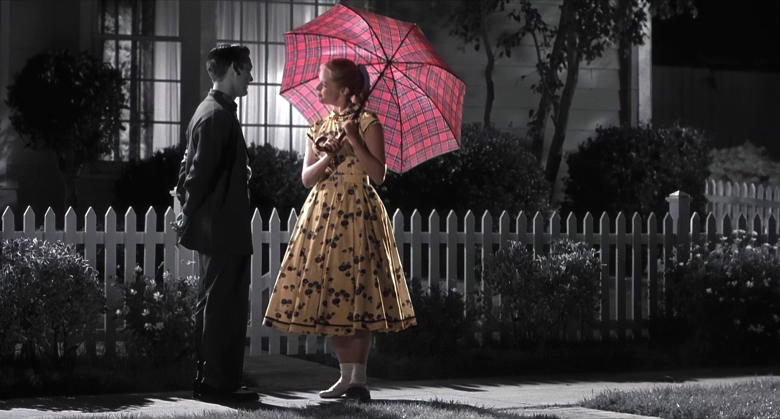
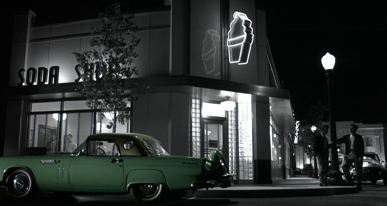
There is no breaking news or unpredictable weather in the perpetually cheerful yet gray-toned world of Pleasantville, and all roads stop at the edge of town. For David (a.k.a. Bud Parker), it’s a perfect world where the high-school basketball team never misses a shot. It’s a different story for Jennifer (a.k.a. Mary Sue Parker), who rebels against the blandness — thus causing her skin tone and clothing to return to their normal colors. Her influence on others has magical results. The town artist (Jeff Daniels) begins painting in color. When another character begins to develop skin tones, her husband assures her it will go away. With cautious hesitation, however, she replies, “I think I like it.”
Some of the town’s monochrome population struggles to maintain the status quo, while others begin to question the values espoused in their sterile world. A rose turns pink, the grass becomes green, and eyes turn hazel. Pleasantville becomes a divided city.
New Line Cinema cast Bob Degus in the role of Pleasantville's producer, and he assumed responsibility for overseeing and driving postproduction, which involved creating nearly 1,700 visual effects shots. “This is the kind of film I’ve always dreamed about making,” Degus says, “because it has the ability to touch people and make them think.”
Ross recruited visual effects supervisor Chris Watts, who organized a boutique facility for the project (aptly dubbed Pleasantville Visual Effects), and color effects designer Michael Southard, who was responsible for supervising color-timing during the transfer of the original negative into digital data files and for colorizing the images. It was an ironic twist for Southard, who began his career at Color Systems Technologies (which included colorizing black-and-white movies for Ted Turner) and has also added spot colors to black-and-white commercials and music videos.
“One of the initial hurdles was finding a practical way to convert the negative to data without compromising image quality,” says Degus. “We investigated using a high-resolution digital film scanner, but that process would have been too slow and costly.”
Watts suggested using the Philips Spirit DataCine at Cinesite Digital Imaging in Los Angeles for converting the film to data. Cinesite developed and plugged in new software for the task, which enabled Southard and senior colorist Richard Cassel to preview and color-time the camera negative on a video monitor before it was converted to data.
Phil Robinson (director of Field of Dreams and Sneakers) and Sean Daniels (producer of Michael) steered Ross to director of photography John Lindley, based on their own collaborations with him. Ross called Lindley, and told him the entire story of Pleasantville during their first discussion. “His enthusiasm for the story and the process was infectious,” Lindley says. “I read the script before we met, and I loved it. I liked the allegory and the message, but what appealed to me most was that the photography was an integral part of the story.”
Lindley and Ross began their preparations by looking at still photographs. “I had a book of hand-tinted, black-and-white pictures from Japan that provided a good jumping-off place,” the cinematographer recalls. “We agreed that if you had a black-and-white scene with one person in color, [the color individual] should be desaturated so that he or she wouldn’t jump out too much — except in some scenes, where that person should be heavily saturated in order to purposefully jump off the screen.”
Lindley and Ross decided to shoot in the standard 1.85:1 spherical format to stay closely in tune with the visual style of the 1950s. “The anamorphic format would have been overpowering,” the cinematographer explains. “Gary felt strongly that when David and Jennifer were in Pleasantville, it had to feel like the real world, where there is something around the corner, rather than it being a set for a TV show. I thought that was a great instinct on his part.”
There was considerable discussion between Lindley and Ross about the possibility of shooting in black-and-white and adding color in postproduction. However, after shooting many tests, they decided to originate their live-action shots with Eastman EXR 5248 and 5298 color negative films. “The driving factor was that every frame of the movie was going to be scanned, digitally manipulated and recorded back onto color intermediate film at 2,000 lines of resolution,” says Lindley. “When we tested black-and-white film, it was evident that by the time it was run through a recorder, it wouldn’t be sharp enough to create the feeling of reality we wanted. Modern color films have multiple T-grain layers and therefore record much sharper and cleaner images.”
Cassel notes that using color stocks throughout the production would also eliminate any conflicts in grain and sharpness that might have resulted from intercutting color and black-and-white stocks.
One of the black-and-white tests was a shot of a woman sitting by a big bay window with her arm on the armrest of a chair. In order to simulate reality in the colorized version, the filmmakers had to add a pale-blue highlight, the reflected color of the sky. “Our tests revealed a lot of unexpected incidents like that, which give color its real dimension,” Lindley says. “It would have been an enormous undertaking to instruct the colorist [or digital artist] where and how to add reflected color light. It was a lot more accurate and efficient to start with a color image, even if it had to be radically manipulated.”
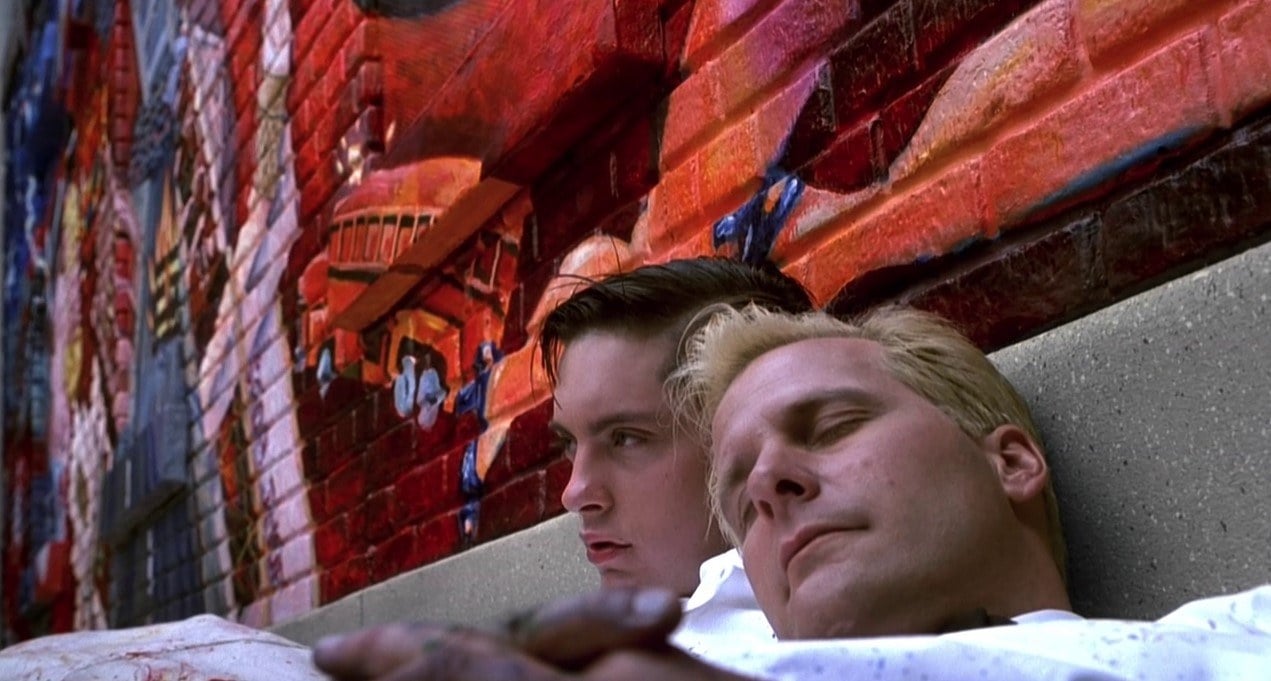
Lindley and Southard discussed how colorizing technology could be used without, in Lindley’s words, “taking all the oxygen out of the movie.” Most mixed-scene (color and black-and-white) images in Pleasantville are about 70 percent black-and-white. “Michael [Southard] was essentially pre-timing the negative,” says colorist Cassel. “We’d look at a scene, and he’d tell me, ‘Don’t worry about the foreground, because it’s going to be black-and-white. But that mural on the wall has to stay in color, and I really want the reds to pop.’ He’d show me what colors in the mural were critical, and we’d concentrate on getting them as close to what he envisioned as possible. That saved time in the subsequent image processing on workstations. We were scanning at 2K resolution —1,920 pixels by 1,440 lines. That’s about 11 megs per frame. In the beginning, we were transferring two frames per second. At the end we got it up to four after getting new software from Phillips.”
During the offline editing process, Ross identified which scenes were going to be in the final cut, allowing Watts, Southard and the team of digital artists to get to work. One of the key tools they used was Shake, an open-system compositing software toolset created by the Venice, California, software film Nothing Real, which formed the basis for their proprietary interactive color-correction software program. Meanwhile, the Pleasantville team’s primary hardware consisted of Silicon Graphics 02 platforms, as well as SGI Octanes for more conventional applications using Matador paint software.
The team first developed some “2,000 art prints,” each of which represented a shot. This gave Ross a convenient frame of reference for the colors and saturation in every shot. His response provided a template for colorizing the rest of a given frame.
Two Solitaire film recorders were used to produce digital film dailies, which were output on fine-grain Eastman EXR 5245 color negative film. The recorders were calibrated so that the 45 emulated the imaging characteristics of the Eastman EXR 5244 color intermediate film used by the Lightning film recorder at Cinesite. “That enabled us to look at dailies that were a close approximation of the intermediate film that Cinesite was going to provide to Deluxe Labs as a master for release printing,” says Degus. “There was little margin for error — maybe one printer light — if we were going to maintain the integrity of our black-and-white images on color print film. Even a slight shift will give you a magenta or greenish cast where you want pure blacks. We needed every edge we could get, which included using the laser recorder at Cinesite to transfer images to the intermediate film as flawlessly as possible.”
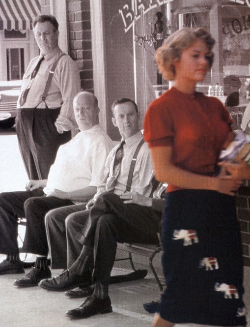
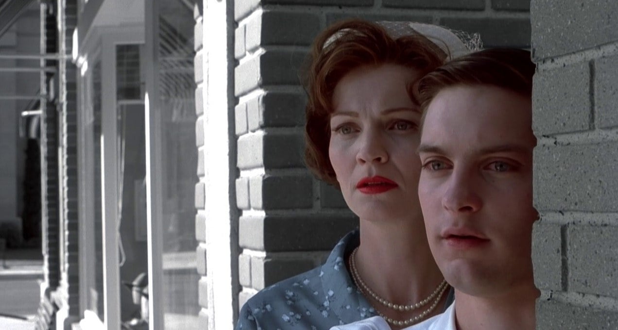
surprise as the colorful Mary strolls past
their perch.
Lindley made several accommodations to shooting color film for conversion to black-and-white. He used hard light to get crisp separations in scenes with monochrome characters. He also used a dimmer control board for lighting transitions when a black-and-white person left an area and a color character moved in. “The black-and-white characters would be hard-lit, even though they were occupying the same space where we had soft light on a color character,” Lindley explains. “Almost every light was wired to a dimmer board. The operator watched a monitor with a live video feed from the tap on the camera. We did a lot of cues on the fly as people moved around sets.”
Lindley orchestrated lighting based on what Ross wanted the audience to watch. “Your eye naturally goes to color in a black-and-white world,” the cinematographer notes. “If you pick up a newspaper that has one color photograph and a bunch of other black-and-white ones, everybody looks at the color one first. It’s human nature.” He further explains that the same dynamic applies when there are color and black-and-white characters in the same shot. “That was great if [the black-and-white person] was the character Gary wanted to highlight,” he says. “But if it was a two-shot and he wanted to feature both characters, I sometimes adjusted the composition to give the black-and-white person a little more prominence.”
Lindley also did research to find out which lenses were primarily used on 1950s films, and eventually decided that a 40mm lens came close to a typical choice from that period. “It’s not a long lens, and it’s not terribly wide,” he observes, “but on closeups, we were able to show the audience a lot of background, which was important. We also gave the movie a progressively more contemporary look as the story evolved and the characters became more modern in their thinking and action.”
Lindley did this very subtly with just a touch more aggressive camera movement, and by using longer 100mm and 150mm lenses — as in a sequence in which the first black-and-white kids cross over into the world of color. He also restricted the use of a Steadicam to that type of sequence. “The complexities and volume of details were a bottomless pit,” Lindley says. “Everything I had ever learned about color theory was up for grabs.”
The production’s main location was in Malibu, California, which established the Pleasantville town setting. Some practical interiors were found in Long Beach, while additional sets were built on stages at Warner Bros, in Burbank (including the street where the Parkers live).
Lindley credits Watts with coming up with fairly high-quality digital video dailies, but he felt they were more indicative than representative of the way the film would look. Ultimately, he stopped looking at the digital dailies because they weren’t representative of his lighting, and he felt it would be a mistake to respond to what he was seeing even on a subliminal level. Instead, he relied on the integrity of the tests he had shot. Lindley says that the film prints don’t look anything like the digital dailies. In retrospect, the cinematographer feels that not having some form of projected dailies was a real burden, especially on a film with such complex imagery.
Lindley’s timing options at the lab were also limited. When there were color and black-and-white elements in the same frame, he points out, all he could do was make the images lighter or darker. He couldn’t alter colors without affecting the black-and-white elements of the scene, and that wasn’t an option. “Gary, Mike and Chris have spent months making critical decisions about levels of saturation and testing it with audiences,” Lindley says. “You can’t just say, ‘I’m the artist, and I want darker prints, and oh, by the way, it’s going to be more saturated.’”
Lindley describes his camerawork in Pleasantville as “subdued.” He and Ross discussed using a voyeuristic point of view but pulled back from that idea. “The story and characters are so strong that they don’t need to be underlined,” he says. “We felt that if we leaned too hard on the concept, it would cave in.”
Like the other films Ross has written, Pleasantville is rich with dialogue. How does Lindley motivate the audience to listen? “I just know what makes me listen,” he replies, “and it’s almost always the opposite of what you think. When people talk softer, I listen harder. When I see a character listening to what another character is saying, I tend to tune in. But those are mainly editing decisions. It’s my job to give the editors the coverage they need.”
Lindley made sparing use of diffusion because he knew the images were going to be softer just by virtue of the postproduction process. Shooting actress Joan Allen was an exception. “I don’t mind if the audience notices we’ve softened her look a bit,” he says. “It’s a nod to the conventions of filming actresses in the Fifties.”
Most scenes were filmed with two Panaflex cameras covering the scene from a similar angle. Occasionally, Lindley cut the second camera loose and told the operator, “Okay, see what you can get.” Though that footage accounted for a very low percentage of the film used, the cinematographer describes some of it as “really wonderful found art. I lit the scenes for the A-camera. If the B-camera got something that didn’t look as if it was lit in context, I knew that Gary and the editors had the taste not to use it. We had two B-camera operators, Larry Karman and Henry Cline, and they were both innovative. Ken Ferris was the A-camera operator.”
Cinesite’s Bob Fernley notes that the intermediate film produced with the facility’s Lightning laser recorder is a mirror image of the picture information in the data provided by the Pleasantville postproduction team. “Our recorders are very solid in their calibrations and don’t vary from day to day in their exposures by as much as half a printer light,” Fernley says. “Even so, we generated daily test frames with a gray-scale patch and a second one for red, green and blue values. The lab used the tests as a guide to making changes in their processes for handling film that had run through our recorder that day.”
Colin Mossman, executive vice president of technical engineering at Deluxe, points out that when you are printing black-and-white images on color print film, even a one-point difference in a printer light can create a sepia, blue or green overtone. “You would see a black-and-white image with a faint tint,” says Beverly Wood, vice president of technical services at Deluxe. “It may not be unpleasant to the eye, but it wouldn’t be the pure blacks and whites Gary wanted. We are doing what is necessary to maintain the integrity of the images. We stop printing if we don’t think everything is right.”
Asked what he learned from this experience, Lindley replies, “Aside from the aesthetic and technological challenges, I learned that there’s a new player in our universe. In some movies, the visual effects supervisor is just the person who does stuff with the monster and tries to make it look real. On other movies, like Pleasantville, he or she can have an effect on contrast, brightness and all of the things that the cinematographer normally controls. I was very lucky that Chris and his team were blessed with a creative aesthetic and respected my work. This is something every cinematographer should be aware of. Who knows what will happen with people who don’t have that same feeling or talent?”
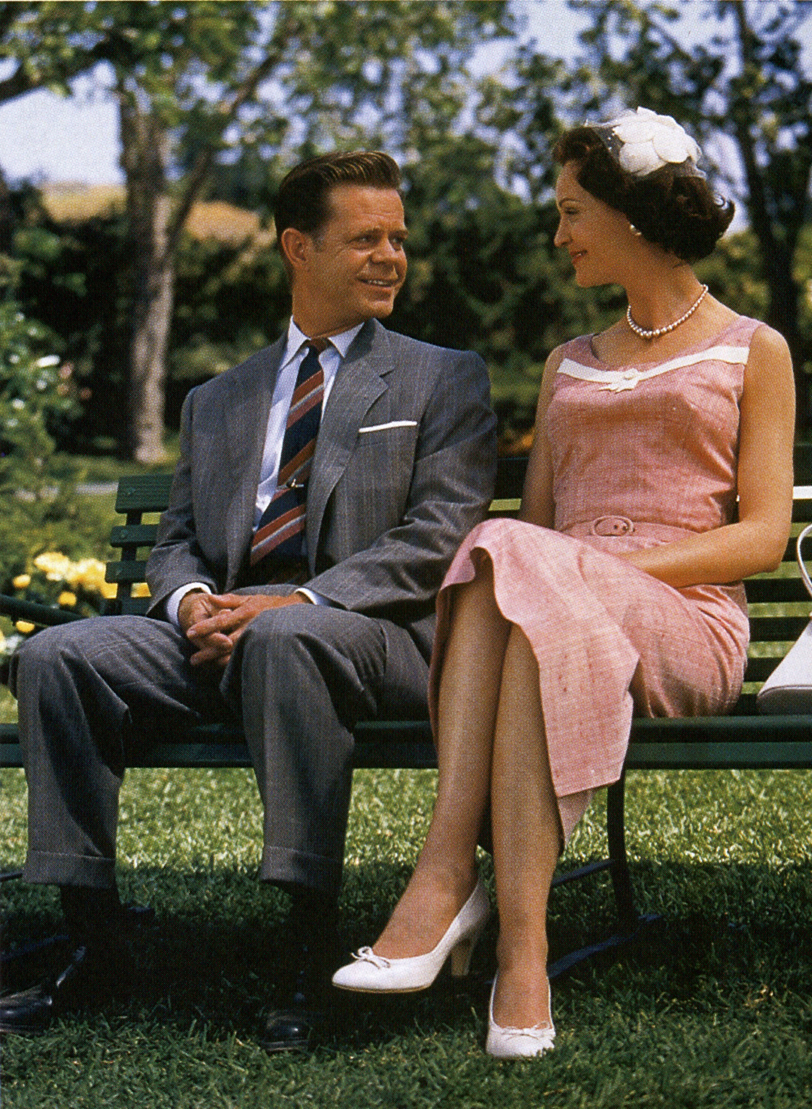
their feelings for each other.
Ross believes the possibilities offered by color manipulation are virtually limitless. For example, early in Pleasantville, one of the characters wears an electric blue dress that draws the eyes of the audience like a magnet. That wasn’t the result he wanted, so he toned down the blue. Technically, he says, there is no reason why the dress couldn’t be red in China, where that color has a different symbolic meaning than it does in Western countries.
Degus summarizes the film’s overall effect by quoting something that the fictional Mr. Parker says near the end of the film: “Gosh, I wonder if they realize how lucky they are to see colors like that?” Describing the effect that production had on him personally, he concludes, “It made me think about green trees and the blue sky and all of the things we take for granted. That’s what makes this picture so special.”