ICS 2018 — The Crown: A Conversation with Adriano Goldman, ASC, ABC
The cinematographer details his award-winning work on the period series, shooting with the Sony F55 and changing looks to elicit drama, story and character.
For this unique four-day event, the American Society of Cinematographers invited peers from around the world to meet in Los Angeles, where they would discuss professional and technological issues and help define how cinematographers can maintain the quality and artistic integrity of the images they create.
The cinematographer details his award-winning work on the period series, shooting with the Sony F55 and changing looks to elicit drama, story and character.

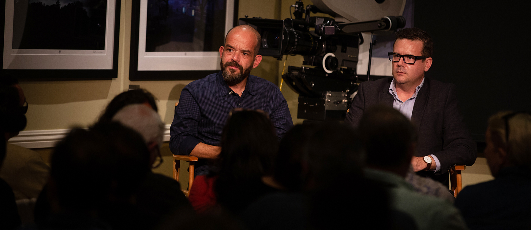
At the ASC Clubhouse on June 4, International Cinematography Summit 2018 attendees heard Adriano Goldman, ASC, ABC in conversation with moderator Jim Hemphill about the cinematographer’s work on the second season of the Netflix drama series The Crown. Goldman reported that the basic parameters of shooting Season 2 didn’t differ much from the first. “Same camera, same lens, same filtration, same way of lighting sets,” he said. “The period also didn’t advance too far.”
The show uses the Sony F55, Cooke Panchros and, often, Tiffen Glimmer Glass. “When I joined, I was told that Netflix demands a 4K workflow from beginning to end, so I tested the Sony F55, the Sony F65 and the Red Dragon,” said Goldman. “The F55 was the smallest and easiest camera to work with, so it felt like the best way to go.”
Goldman always has his light meter at hand, he said, but is relying more on waveforms, particularly Starlite, which offers a click-and-drag touchscreen. “I very rarely underexpose my footage,” he explained. “I never go for the final look. So there’s always a little bit more information that I can grade out.”
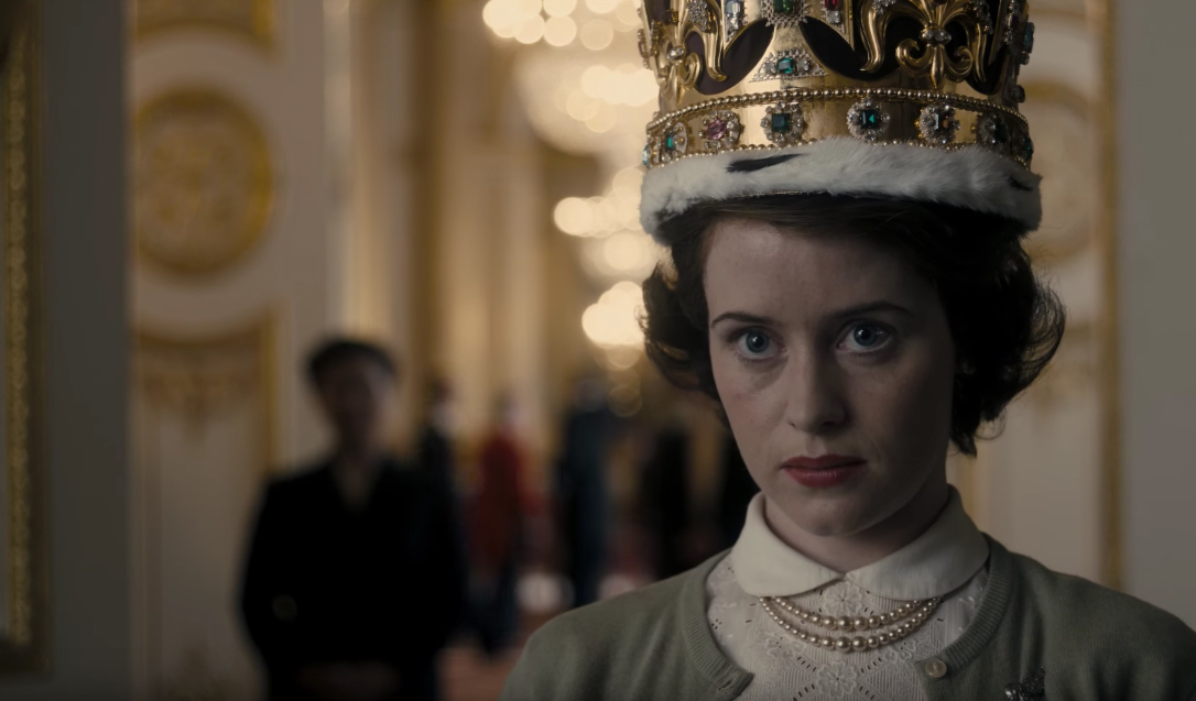
Before shooting, the team did its research, but Goldman noted that there weren’t many specific visual references. “When we started on Season 1, Downton Abbey was super big,” he said. “We have thousands of books in the office about the royal family, locations and so on, so there’s lots of visual research. But we don’t use that as weapons. The main conversations were about the things we didn’t want, like unjustifiable backlight, and how to look different or fresher than other period shows. We wanted to rely on practicals — the naked look. It shouldn’t look too glossy or even Hollywood-like.” Cold skin tones are also something Goldman says he likes, for example, “because it changes and gives you a different texture.”
Goldman, who said director Stephen Daldry brought him onto The Crown, also revealed his close collaboration with the production designer Martin Childs, whom he describes as “very special, dedicated and meticulous. I have my desk in the same room or next door; I always have specific requests for positions for windows or built-in lights. My father was an architect so I’m fascinated by floor plans.”
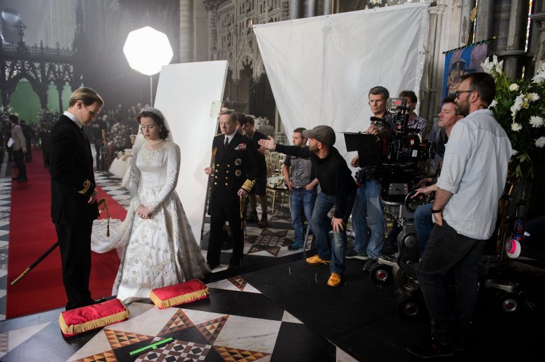
In Season 2, said Goldman, there was no conscious decision about the need to evolve the look from Season 1. “We’re having that conversation now about Season 3,” he said. “How much do we want to change, especially knowing it’ll be an entirely new cast? Is it time to change my approach to the show, or should we deliver consistency when so much is changing?” With regard to the look, he added, the script is the inspiration, such as when Princess Margaret visits Anthony Armstrong-Jones’ studio to have her birthday portrait taken. “She’s visiting his place for the first time, and we went to those places three or four times,” he said. “There’s always a discussion about how long we spend in each place, and what the rhythm of the scene will be. It’s visually rich, and that depends on how rich the script is. With director Ben Caron, I don’t need to add coverage to every single scene, and that makes it less stressful than the usual TV series. We find more time to discuss blocking.”
Overall, he said, because the Queen’s life doesn’t have much improvisation, the general rule of thumb is “less is more.” “That was the goal both with pace and coverage,” said Goldman. When the production went to Africa, he added, “it could feel different. We could be handheld and go way warmer in the grading.”
Hemphill asked Goldman how he sees his role as cinematographer in facilitating the best performances. “I do what I do because of the actors,” he said. “It’s always been my favorite thing to watch, and being an actor is the hardest thing in the industry. We didn’t want the camera to be far away from them; it should never feel documentary or that the camera is a character. We should be physically close to them, feel their breath. The realism is always the starting point. It looks like there’s no lighting but, of course, there is. The actors do appreciate that.”
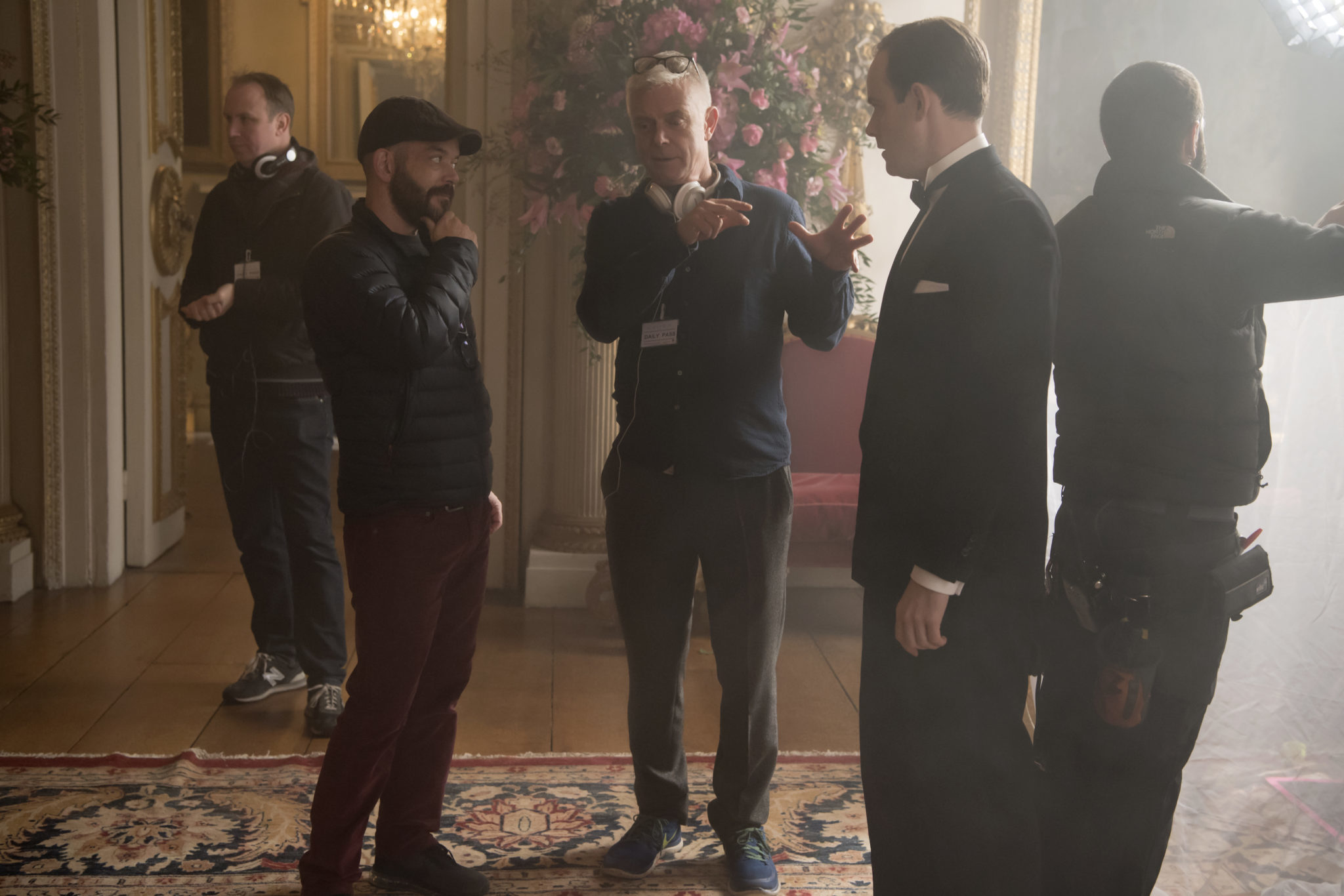
The main unit always has two cameras. “This is a philosophical approach and something I try to protect,” said Goldman. “A camera is the director’s camera, and it tells the story, while B camera fishes for stuff. But if you use too many profiles intercut with A, you’re giving it away as a B camera shot. Goldman’s B camera operator — Gordon Segrove — was his focus puller for years. “He’s always offering something, and many times I have to tell him, just rest,” said Goldman. “If you provide it, the editors will use it, even when the director says no. If we all decide to go on profiles, that’s a good opportunity for two cameras and two profiles. The way the editor cuts the scene, they all look like dedicated shots.”
“It’s a mix of creative forces, starting with the director,” said Goldman. “It’s a subtle way of working. In the first two weeks of Season 3, we’ll struggle for a few weeks to introduce this way of working to a new cast. It should be visually consistent but it already feels like a new challenge. It’s the Cold War, and I could go more contrasty, or colder.”
“Every episode is a new story, so their
episodes can look different,
especially if they follow the rules.”
Hemphill mentioned that some have said The Crown has a “Scandinavian look.” Goldman responded that he doesn’t think so, although he’s watched lots of European films and appreciates the softness. “I remember discovering Sven Nykvist [ASC],” he recalled. “But I don’t think it’s conscious or that I’m searching for a reference so I can click on a process or a specific grammar.”
From the beginning, the filmmakers did consciously try to avoid the look of Downton Abbey and other similar period films featuring Queen Elizabeth II. “And there are so many,” said Goldman. “The starting point was an empty, glossy look — sophisticated but still real, from costumes to the light. For example, Stephen insisted that, in Season 1, because it’s just after World War 2, Buckingham Palace should look run-down.”
Among the clips Goldman showed was the one in which Jackie Kennedy visits the Queen and the two have a very awkward tea. “It’s a face-to-face conversation and the scene goes on and on,” he said. “The director said, it’s about the scone. Claire [Foy, who plays the Queen] gets it. We see her butter and jam her scone and that reveals how nervous she is.” With that, Goldman again focused on the importance of the script. “If you read it, it’s a series of long conversations,” he said. “Our challenge — and a conversation we had often — was to make interesting, organic transitions between the long scenes. Rhythm was a constant conversation.”
In another clip, a young Prince Charles is at school playing rugby in a muddy field. “It was amazingly muddy and we questioned if we wanted to be on sticks,” said Goldman. “So we decided to try something a little fresher. It’s supposed to be shaky, especially if you’re cutting in with the queen who is sitting down having a formal conversation.” Although this 43-page script has 100 scenes, it doesn’t read fast or look cutty, said Goldman. The foregoing sequence was four minutes long. “It’s so rich — rugby, conversation with the queen, letters with his uncle, all the outfits…”
The show is, said Goldman, supposed to be “slow, dark and gray,” which he pointed out in one shot of a plane crash and some subsequent scenes in a forest. In another shot at night, some youngsters jump over a wall to explore a graveyard. “There’s always a conversation about flares,” he said. “I had used a light on a radio tower [while shooting the feature] Sin Nombre, so I thought I could use the same strategy. On day two, when I panned over the kids jumping the wall, the creative producer asked me what this light was. I couldn’t find an answer, so I just said, ‘That’s the light that makes everything beautiful.’ He didn’t ask again. There was an opportunity, even on a show like this, to be less realistic and more magical.”
Goldman said he is already testing for Season 3. “We did a test with the Sony Venice and I had a good impression of the blacks,” he said. “We don’t want to change the workflow and with the Venice it’ll still be in 4K. Now I’m also considering the lenses again. We’re having a look test with cameras, and I’m going to explore different haze densities with diffusion filters. It’s getting more difficult to achieve a super-contrasty look, and there is a good chance that one or two episodes will be more noir-ish. That will be an interesting thing to test.”
Caron, who was Season 1’s junior director, is now the main director for Season 3. “He’s showing a level of dedication that’s amazing,” said Goldman. “He’s directing four episodes back-to-back and they’re all very different from one another. We’ve discussed color tones. He insists on a tone meeting with the three new directors, so we can show them still photos from the first two seasons.”
“Ben also is bringing references and research material, but it’s going to be the first two seasons working as a reference for Season 3,” Goldman continued. “If I were one of those new directors, I would love a meeting like that. I think it helps a lot when you’re styling a show. Every episode is a new story, so their episodes can look different, especially if they follow the rules.”
Go back to the main ICS page.

