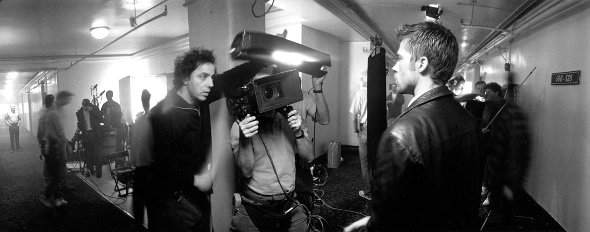
Seven: Sins of a Serial Killer
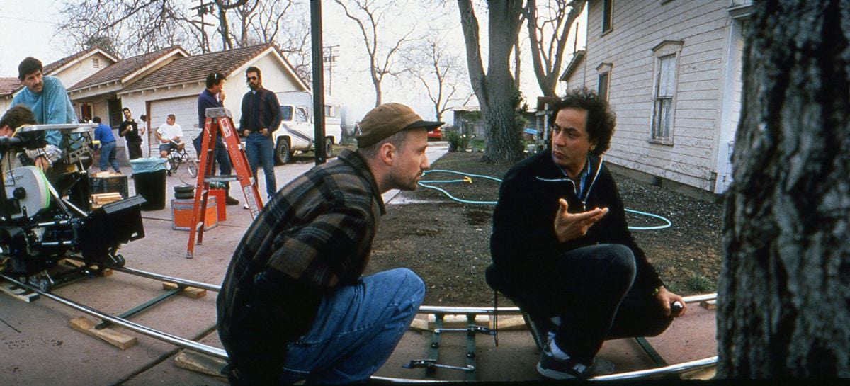
Director David Fincher and cinematographer Darius Khondji, ASC, AFC bring the Deadly Sins to the screen in this scary, stylized thriller.
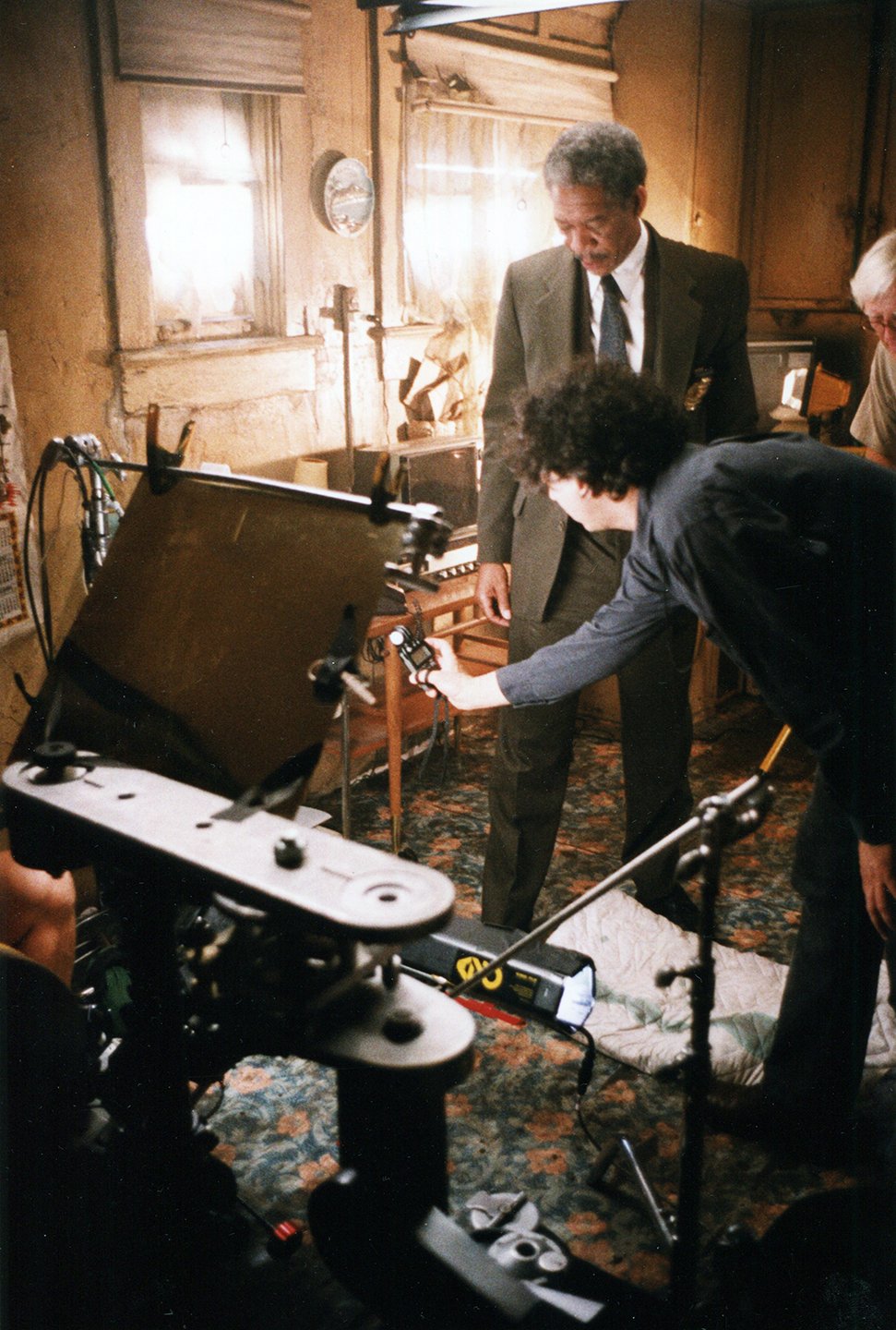
Unit photography by Peter Sorel, courtesy of New Line Cinema
Recalling how David Fincher first described his approach to Seven, cinematographer Darius Khondji, AFC excitedly echoes the director’s whispered words: “It’s got to be frightening.”
But the nature of the “frightening” film has transformed dramatically over the last quarter century, with plays on shadows and suggestion such as The Haunting contorting into the all-too-real ghastliness of The Silence of the Lambs — with The Exorcist perhaps designating a transition point. What was once goosebump-prompting has been overwhelmed by lurid real-life headlines proclaiming far more terrible tales than even Hollywood is offering these days. Ironically, while the construction and devices of the fright film have changed, the horrors played out are still motivated by the worldly ills fabled by the Greeks to have been released by the curious Pandora. And in the case of screenwriter Andrew Kevin Walker’s Seven, a hybrid detective-thriller, those universal turpitudes are given grisly new characterizations.
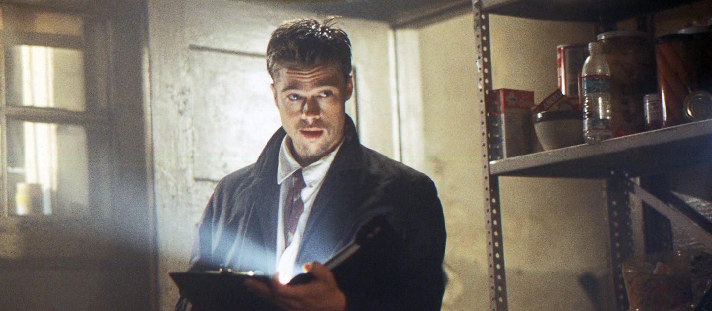
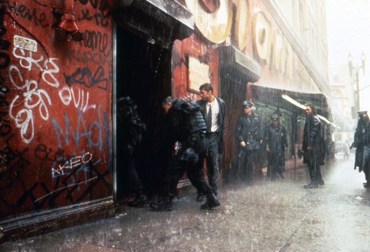
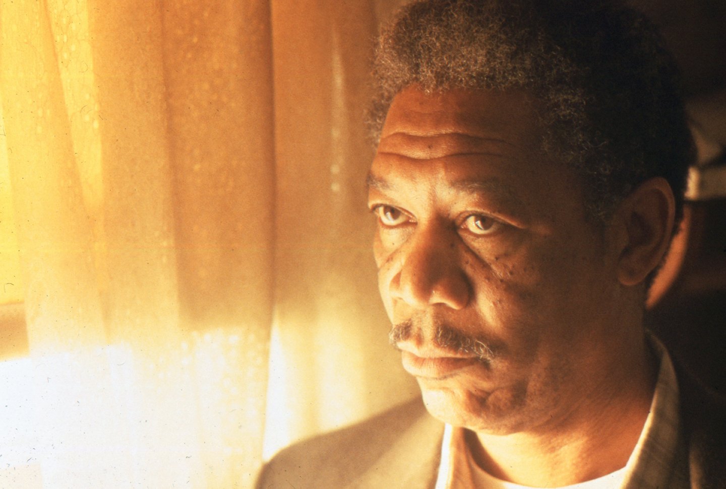
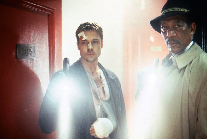
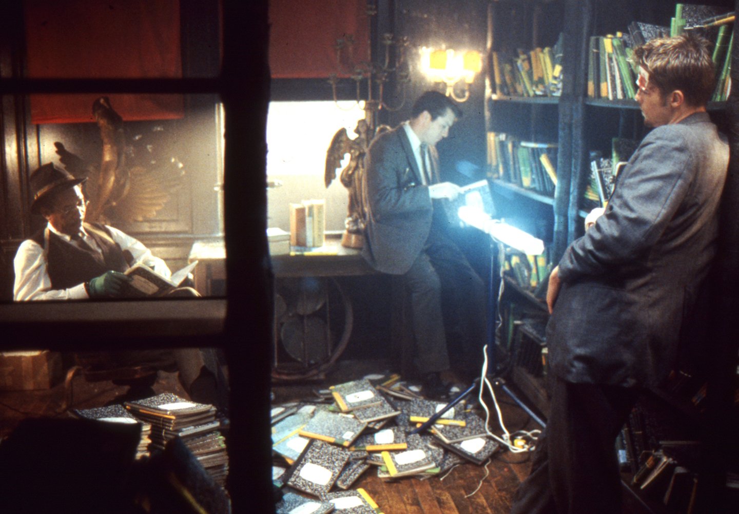
The film trails Lt. William Somerset (Morgan Freeman), who is anticipating retirement after breaking in his ambitious yet inexperienced replacement, Detective David Mills (Brad Pitt). But the case unfolding before the duo draws them deeper and deeper into the bent mind of a serial killer seeking revenge for society’s ills. His crimes, based on the Seven Deadly Sins, interpret Sloth, Gluttony, Pride, Greed, Envy, Wrath and Lust as perversely thematic statements — the victims serving as metaphoric centerpieces in scenes resembling bizarre art installations.
While gruesome, the material struck a chord with Khondji, who initially became interested in film as a young teen in Paris. “I’ve wanted to do a film like Seven for a long time; I grew up dreaming about it,” he begins. “I was originally introduced to cinematography by going to horror films. The first time, my mother took my sister and me to see King Kong, but just as the titles were coming up, the police came and forced us to leave because I wasn’t 13 yet — the film was forbidden for children so when I turned 13 I went to see all of the horror films I could: Roger Corman films, the Hammer Studio films — all of them. Films like Dracula with Christopher Lee were very important to me when I was a kid.”
But Khondji was ultimately more fascinated by the moving image than by mere chills, and soon found that he didn’t enjoy only horror pictures any more, but all films. Meanwhile, by the time he was 16, he began making shorts on Super 8, even though he still wasn’t really aware of cinematography as an occupation and “thought the director was the one holding the camera.”
Pursuing his interest, Khondji traveled to study at New York University, where he immersed himself in cinema. He recalls, “Important films for me at the time were The Conformist, Murnau’s Sunrise, and, of course Citizen Kane. Kane marked the first time I looked for the name of the cinematographer in the credits of a film, and I discovered Gregg Toland [ASC}. I started watching a lot of Griffith’s films at the time too, and kept seeing the name Billy Bitzer. I found that other directors often worked with the same cinematographers too: Bernardo Bertolucci and Vittorio Storaro, Ingmar Bergman and Sven Nykvist. I became interested in the connection between them and began watching based as much on the cinematographer’s as the director’s name.”
In the NYU production program, Khondji continued to make Super 8 and 16mm shorts. “My scripts were always concerned with image and ambiance rather than with story,” he says. “I became increasingly fascinated with imagery and experimented with photography; everything led me toward working with light. But I couldn’t admit to myself that I was much more interested in cinematography than writing or directing. Shooting other people’s films at NYU was my first experience strictly as a cameraman, and it helped me find myself because the short films I was directing were all the same — focusing more on imagery. So it was a very freeing experience to work for and with someone else — translating what they wanted and giving it to them.”
After school, Khondji returned to France and soon became an assistant to Bruno Nuytten (Brubaker), whom he describes as “a fantastic cinematographer.” (Nuytten later went on to direct the stunning Camille Claudel.) The experience cemented Khondji’s interest in pursuing cinematography in ways he hadn’t yet considered. He remarks, “I studied how to shoot and light at NYU, and I had a very tough cinematography teacher, but the most useful thing about school was meeting people. I don’t think the most important thing you can learn is where to put the camera or the lights, but how to interact with the director, approach a script and so on — which is what being close to Bruno taught me.”
After returning to Paris, Khondji shot a few shorts and showed one to some close friends and Nuytten. “He told me I should stop wasting my time as an assistant. And from that time on I concentrated only on shooting things myself.
“Even from the beginning I shot a lot of commercials, which I enjoyed because they allowed a lot of crazy experimentation — they became a second school for me. I shot 16mm, blew Super 8 up to 35mm, cross-processed reversal stocks — I did lots of tests. At the time we even went to the printing stage‚ although now we usually just go to D1 — so it was an opportunity to learn that process as well. But it was also a chance to become more selective as people began offering more work to me. The product could be anything, but the opportunities to have complete creative freedom were the ones you wanted, because they allowed more experimentation.” This adventurous attitude became the cinematographer’s calling card in the commercial realm — a card he later played for such fashionable clients as Yves St. Laurent, Calvin Klein, Armani and Lancome and for directors such as Jean Baptiste Mondino, Chico Bialas, Peter Lindberg and William Klein.
Khondji concurrently began his work in features with rock star/filmmaker F.J. Ossang’s Treasure of Bitch Island, a black-and-white, anamorphic, underground feature that became a major cult film in France. The film’s visual panache was even recognized by the esteemed film journal Cahiers du Cinema. And as he had previously shot a lot of black-and-white for both commercials and shorts, Khondji considers himself very lucky that his first feature was monochromatic. “Our generation grew up with color films, so for my early work in black-and-white I had to think of it as a new thing. But black-and-white had become the basis for my learning lighting, allowing me to discover artificial lights in a graphic sense after primarily working with natural light. So this was a great opportunity to expand on what I had done.”
Khondji’s other feature credits include Delicatessen, a social satire about consumption and cannibalism which earned international notice, a Cesar nomination for Best Cinematography and the Gran Prix award at the Chalon Cinematographer’s International Film Festival; significant portions of Before the Rain, winner of the Golden Lion at the 1994 Venice Film Festival; L’Ombre Du Doute, a 1993 Venice Film Festival selection; Models; Marie Louise; and The City of Lost Children, a dream-like, science-fiction themed film from the creators of Delicatessen which opened this past year’s Cannes FIlm Festival.
Indicative of Khondji’s work is a proclivity for interpretative contrast — inherent to his visualization of any story. In an extreme example, Bitch Island was even printed on high-con Kodak soundtrack stock.
“On the very technical side of any film, the most important thing to me is to control a stock’s contrast, or gamma curve,” Khondji explains. “I usually shoot on Kodak, and when you ask for 48 or 47, you get a certain latitude, a certain curve. So I like to change that curve according to the tone of the story, or even to play with it from scene to scene.” To that end, he began using a non-bleaching process in his color work, leading to further experimentation with a silver process that called for his stock to be run first through color baths and then re-souped as black-and-white, restoring silver to the negative and resulting in rich blacks while simultaneously desaturating colors. Delicatessen was his first feature to benefit from this procedure. “The directors wanted very contrasty images — something that would put color into the world of realism poetique, a current of the French cinema of the 1930s and ’40s which was very expressionistic,” Khondji remembers. “So I had to increase the contrast beyond what I could get from lighting.” As the blacks were so deepened by the silver process, Khondji would first use the Arriflex VariCon system to add detail in the shadows, while at the same time pushing the negative a stop to saturate the remaining colors as much as possible. “We put more color back in at every step we could, while at the same time getting these strong blacks — like ink,” he says.
“Also, for the first time I used Chinese lanterns on a feature,” he adds. “When I was a child I had a huge paper lantern in my bedroom, which I loved. So I asked the gaffer on Delicatessen to find us some, which we used on dimmers. I thought I had invented something until someone said to me, ‘Interesting that you use the same techniques as Phillipe Rousselot!” I knew I hadn’t invested anything else, but I thought for sure the lanterns were mine!”
A similar contrast-manipulating processing technique was later executed in conjunction with digital imaging on The City of Lost Children, though at the internegative stage to ensure that resulting prints would be consistent worldwide, “Delicatessen made the way for City of Lost Children, and we then took that technique one step further for Seven,” he says.
Khondji first worked with director David Fincher on a commercial for Nike. “We got along very well,” Khondji says, “especially in the way we talked about movies. I had only seen his film Alien 3, but immediately knew he was a great director.” And after unexpectedly receiving and then reading the script for Seven, Khondji knew he had to shoot the project — and in a particular way. “I call that first impression of a movie the Big Bang — the birth of the film,” he explains emphatically. “Everything comes from it, even if it is just the story in a few lines — all the light, the atmosphere, the ambiance, everything about the way the film is going to look. This first impression helps me decide if I will use one color process or another, certain lenses, lighting with neon or Chinese lanterns or tungsten or HMIs — it gives me the image of the film.
“I later talk to the director, whose first words and descriptions are also very important to me. Some know exactly what they want and others are not so structured — that’s not so important, though if they have ideas, things will usually move faster. But it’s their emotions about the story that are very important to me. And then come the actors and how you will work with them, because for me the camera and lighting are like other principal performers. You come as a cinematographer to the world of the director and you must then perform within it with the other actors. It’s the trip you go on with the director. My relationship with the director is like being his closest friend. He is my brother, my family.”
Possessed by the story for Seven, which spoke to his heart as a horror fan, Khondji found inspiration while walking the nighttime streets of Manhattan. “The moisture, the colors, the water, everything felt right for the movie — even though it was to be made in Los Angeles, and I didn’t even know if I would be shooting it yet,” he says. “The studio, the unions — they had to accept me and everything had to be arranged. But the pictures were coming to me.” In reference to a Don Siegel science-fiction classic, he jokes, “It was growing inside me like a body snatcher — filling me and taking me over.”
When he finally talked with Fincher about their approach to the film, Khondji realized the dilemma of working with a highly visually-minded director. “It’s easy and very tough at the same time. He knows what he wants, but he also has the mind of a cinematographer; you have to bring him more than what he wanted. If you just do what he asks, it’s not enough. So you have to bring up a mixture of what you have in your soul to what he wants. For me, David is like Ridley Scott when he did Blade Runner or Alien — there is a vision in him that is very strong. I had never experienced it before. Jean-Pierre Jeunet, the main director of Delicatessen [and City of Lost Children], was visual in a different way, but not like David in terms of his [all-encompassing] approach to camera, lighting and composition.”
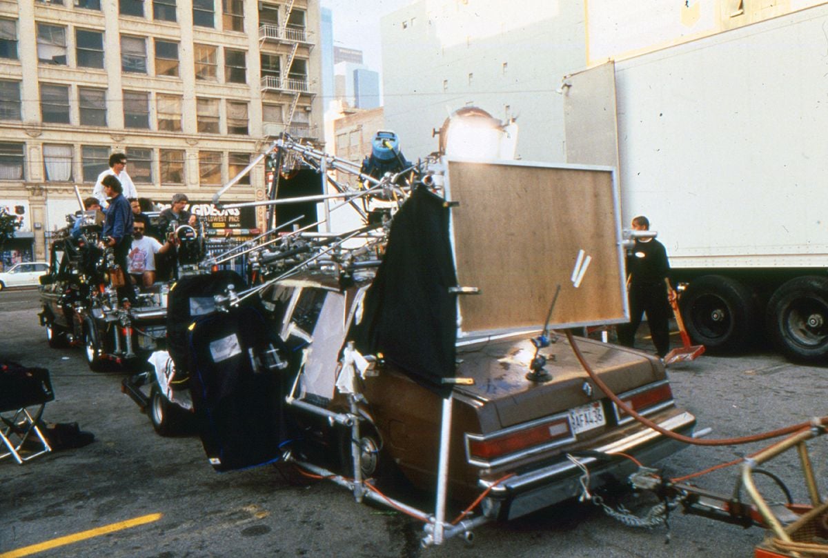
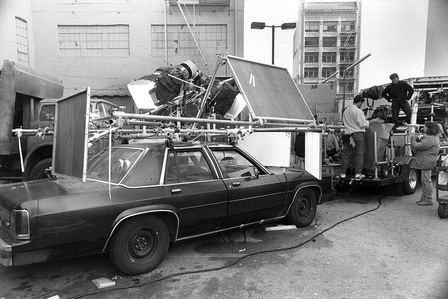
Khondji had shot all of his previous films in Technovision, using a combination of Arriflex cameras and anamorphic Cooke lenses. But this time, he didn’t have time to get the Arri outfit he wanted, so he instead opted for Panavision, a system he had never used before. “I was very well received at Panavision in both Hollywood and Tarzana,” Khondji notes. “They offered time to test all the equipment, and I looked at their Primo lenses, which I found to be very sharp, very graphic and contrasty — very beautiful.” In describing his enthusiasm for the Primos, he makes special note of the Primo 24-275mm f2.8 zoom which was also used on the shoot.
Working closely with Fincher, Khondji felt that Seven“should be scary, but very modern,” prompting the duo to seek out visual examples of the look they wanted. “One of the first books I brought with me was The Americans by Robert Frank,” says Khondji. “It became a bible for me. It’s all black-and-white, but the photos have the spirit of modernity. You feel the dynamic in Frank’s photography — which also helped me decide on the Primo lenses. The Panavision system is great, but I wanted the Primos which I knew would give me that same feeling. So we shot the movie on Primo lenses in Super 35.”
Describing the influences that led them to use the format, Khondji says, “We wanted to have this tough, handheld image mixed with some Steadicam — in the spirit of The French Connection, but also stylized and scary with spiritual lighting, like Klute. So those inspirations mixed with Robert Frank and led us to shoot in Super 35 instead of anamorphic because we wanted this incredibly free camera. We wanted to use the wide frame, so even in the tight inner-city locations we could have two close-ups at the same time, but we also wanted to be able to move the camera in any direction, at any time, without the heaviness of Cinemascope. We wanted the camera to float.”
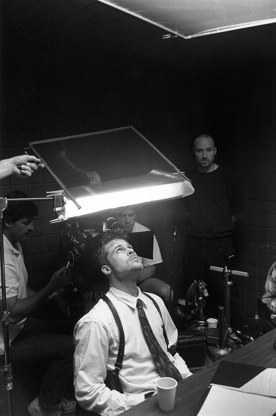
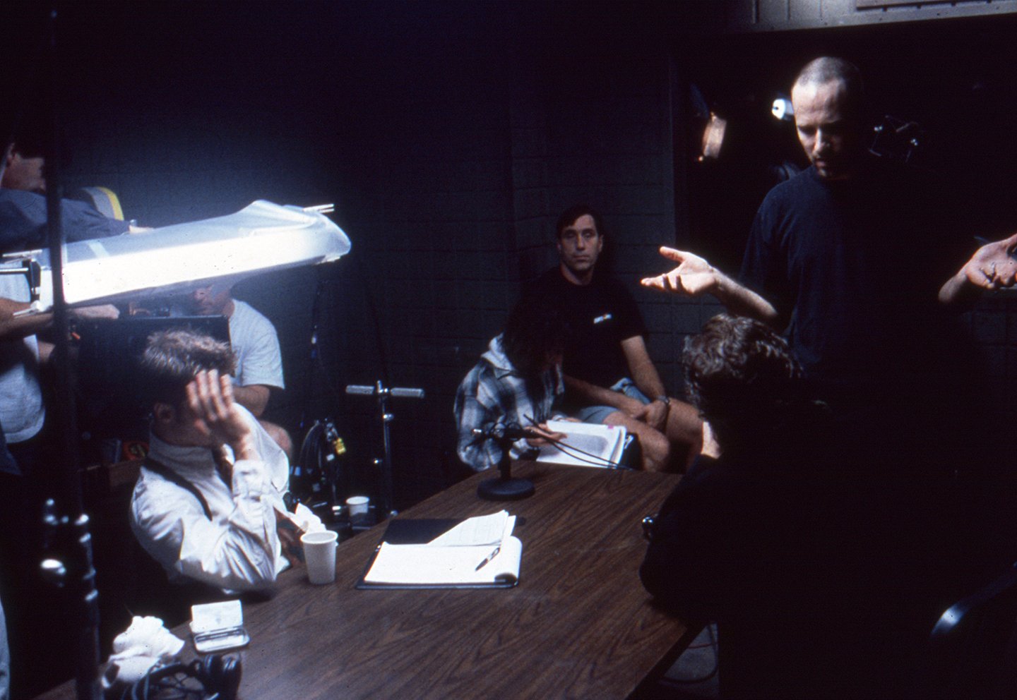
Serving Khondji’s Panavision debut was his first American crew, which earned high marks. “I had a fabulous gaffer, Chris Strong, and an amazing young grip named Michael Coo, who worked on Speed. They were super-intelligent, and they were always behind me, supporting me. I also had a great camera operator with me, Conrad W. Hall, who is brilliant and moved the camera exactly as David and I wanted it — with perfect energy. I rediscovered Steadicam on this picture because I had a terrific young operator, David Emmerichs, whom I highly recommend. He used the Aaton 35, which gives wings to the Steadicam. It was incredible to have this very light camera with the Primo lenses; it was like combining two different worlds of cinematography.”
To get the coverage the director wanted in limited time, Khondji often shot with two cameras. Either the Aaton or another Panavision Gold played the secondary role.
Having decided on his hardware and the aspect ratio, Khondji turned to film stocks. “Every movie to me is a cocktail, with the technical side blended according to the kind of image you want,” he offers. “Seven is set in an unknown city, all wet, gritty, crumbling and dirty, with the only warmth in places of security — a police station, a home. It could be Chicago or New York. I wanted to use the silver process and push the stock to get a feeling of grittiness, but we did a lot of tests at Deluxe to find a new look for this picture. We tried Kodak’s 5292, 87, 98 ,48 and 45 and ended up shooting the interiors — all the gritty stuff — on 93 rated normally. The beginning and ending exteriors of the film were shot on 45, slightly filtered with the 81 series.”
For nighttime scenes, Khondji felt that 5287 would give him a special tool for depicting Seven’s sense of darkness. He explains, “In Europe, a lot of people are scared of this stock; it is the Great Satan. They say ‘Oh, 87! You use it?’ But it was fantastic for this film. I never used it for ‘normal’ or interior scenes; I used it for night shoots and car interiors. With the silver process, pushing it a stop and sometimes using the Panaflasher, the blacks in the 87 became sorich, increasing the contrast between the worlds of light and dark.”
Khondji’s elaborate visual strategy was completed in postproduction by a colour consultant from Paris, Yvan Lucas, at Deluxe. “He is a young genius, and he times all of my movies; he has the perfect feel for it,” the cinematographer says.
Does Seven follow the “color noir” approach pioneered and later re-visualized in such films as Chinatown, Blade Runner and Angel Heart? “Well, those are three of the best-lit films of the last 15 years,” Khondji demurs. “Seven is also a color noir, but it is very different from those films. It uses detective-film conventions in the lighting, as they did, but it is completely outside the conventions of our time. Chinatown was the rediscovery of noir and the best period film of its time, but it was still incredibly modern — very avant-garde. We have gone in another direction with this style on Seven — toward a roughness, a grittiness. We didn’t worry about making things beautiful — Brad Pitt looks beautiful [without any help.]”
Pausing, Khondji laughs, “Whatever you do with Brad, he looks great. He takes any angle or lighting like this perfect creature; for a cinematographer, he is an amazing actor to work with.”
But while Seven has a distinctive overall noir texture, Khondji and Fincher carefully devised different looks for each of the crime scenes that detectives Somerset and Mills encounter. The looks of the various tableaux were determined not only by the thematic Sins, but by the victims’ respective conditions upon discovery. “I saw these crimes as the work of an artist,” the cinematographer says, “like the work of German artist Joseph Beuys, who was the father of modern conceptual art. This serial killer will create scenes of murder with different lighting, decorations, words written on the walls or floor in blood — very weird. You are led into a world of images by the killer, suggested by the Seven Deadly Sins. That’s important to understand as you see the different lighting atmospheres in the movie.”
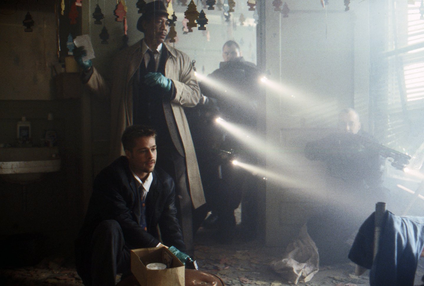
Gluttony is visualized in an early scene as Somerset and Mills find the body of an obese man seemingly force-fed to death, collapsed face-down in a plate of pasta. The dim, filthy room, bathed in a sickening yellow, is pierced by the detectives’ flashlights as they search for evidence. “I love to see the origins of light within a shot, so source lighting is one of the main techniques we used,” says Khondji. “I had the best experience I have ever had with a production designer on this film; the designer was Arthur Max. Most don’t think about lighting at all, but for me, the trio of the director, cinematographer and production designer must collaborate fully. I expect the designer to talk to me about lighting, to offer ideas and rework his design if necessary. Arthur had a wonderful crew and his set decorator and prop man helped me a lot in finding lights to use as practicals.
“The flashlights were normal, though a bit boosted in wattage after we shot tests. Xenon flashlights are too obvious to me; I wanted a more natural feel than that. We also used a bit of smoke to bring out the beams, but there is very little smoke elsewhere in the film.
“Then we would use Kino Flos as a backlight — a very soft line of light — and Chinese lanterns as top light, our key light. We used that combination often, with one and a half stops to two and a half stops difference between the key and fill.
“We shot the entire film almost wide open, so most interiors would be at f2.5 while the exteriors were 2.8 that made it extremely difficult for focus-pulling, but gave a precise plane to the action, so we could direct the viewer’s eye.
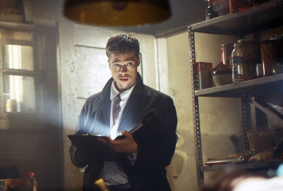
“For me, the Gluttony scene was about darkness,” Khondji specifies. “When the detectives come into the room, it’s very old and shiny — greasy. There is not supposed to be light there. So when they aim their flashlights, the light shines back to them. Turn them off, and the room would be black. The room itself was underexposed, but we would overexpose the flashlight beams to really pick them up, though they were already two to three stops over the room. To have them fill the room a bit, I put bounce cards here and there in the corners and on the floor. I tried using reflector cards, but the look was too vulgar.
“Being under or over a few stops is not much normally, but when you are increasing the contrast so dramatically with a special color process, it is a lot — especially when pushing the stock a stop as well.”
The Lust victim is found tied to a bed in a brothel, bathed in rich red light, which amplifies the horror by filling the room with a crimson glow. In the center of the space, the naked bulb of a practical lamp acts as the only white light source. “That scene was shot almost in silhouette with the exception of some flashes from a photographer’s strobe light,” Khondji describes. “There is green light in part of the room, with the mixture becoming completely red at the other side, a very deep red. We decided on those colors because the scene takes place in a whorehouse and we wanted a kind of Hamburg, Germany look — a passionate, violent, almost monochromatic red, like blood. The color scheme reminded me of the Hammer Studios films I saw when I was a kid.” Other horror fans might also be reminded of the primary-color nightmares of Italian directors Dario Argento and Mario Bava.
Sloth is exemplified in a particularly nasty scene in which a skeletal victim is found strapped to a bed, emaciated after long weeks of prone captivity. Khondji remembers, “This was a very necrotic, green scene, like being under the bottom of a river — with the feeling that time has passed. It had a moist, fungal look. I added a bit of green gel to all the lights, which were all daylight-balanced, just to give the feeling of angst. As in an Edvard Munch painting, you have this green spectrum, even if there is no green within it. But it was also a very eerie location, in downtown Los Angeles, which had been abandoned for years and filled with lead-based paint and very dangerous. It was perfect, with that feeling of rot.
“The practical lights in the scene were given a bit of red, but for me, a practical is usually orange with a ¼ to full CTO or a very cool green. The contrast of color for me is just as important as the contrast of the light intensity. My normal fill light for ambiance is usually color-corrected to match the shadows, to keep the scene cooler.”
As in all the scenes featuring victims, the Sloth sequence relied heavily on special make-up effects for an additional element of shock value. Seven was the first time Khondji had shot extensive prosthetics, leading him to trust the experts. “I got along extremely well with our special effects prosthetics artist, Rob Bottin. He was my friend on this movie and a great supporter. Rob would tell me how to light his effects and I would do it because he had a good feeling for what we were doing and such great experience with the materials he sues. When you work with great people, you should listen to them. They are artists and it should be a collaboration.
“Usually when I see creatures in the movies, they are overlit and it doesn’t look right,” Khondji adds. “A great creator like Rob, who produces amazing work, knows that it is much more important that the effect looks real than for it to be fully seen. That is the only thing. So for the man tied to the bed, we used a sort of contrasty, counter-lit approach I learned by watching the films of Jacques Tourneur: Cat People, I Walked With a Zombie, Curse of the Demon. Those films taught me that you don’t have to show and light everything — that the impression of something is far scarier. Rob’s work was perfect, but the dark parts were the most important, because you have to imagine what is there.”
Tying directly in with Fincher and Khondji’s mindset of modernism, the crimes of Pride and Greed stand out starkly, with white surfaces and bright lighting punctuated by pools of blood — much like Argento’s Tenebrae. “After Gluttony and Sloth, these were totally different situations,” the cinematographer says. “The room of the Pride murder was lit entirely from the windows with 20Ks and Dino lights, 24 Par lights, coming through a lot of diffusion. The concept was that there would be no shadows, with the room being just a wall of creamy soft daylight. There were windows in two directions, so there was no need for fill.
“To continue shooting wide open and maintain the depth of field, we used ND filters to bring everything down. We often did that unless David wanted to have the depth to cover something.
“So here the horror does not stem from the darkness, but from the concept of the murder — how the woman has been killed.”
And horrible it is. Seen in a sort of “before” picture hanging prominently on one wall, the young victim has been grotesquely mutilated: her blood leads from an improvised surgery in the white-tiled bathroom to the bed where she is found. I didn’t kill her, she was given a choice reads a bloody message on the wall, indicating that the woman chose death over a life of disfigurement. (Several types of stage blood were tested for their reaction to Khondji’s elaborate processing/pushing method and the 93 stock.)
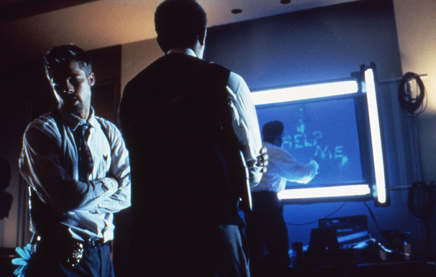
He notes, “The office highrise setting for the Greed killing is similar, but it was shot with much wider-angle lenses and is more contrasty; daylight comes from one direction through windows, and is broken up by shadows running across the floor in a sort of Venetian-blind effect.”
Also shot here was a nighttime sequence in which the detectives use special ultraviolet lights to discover the words help me scrawled on the wall in a sort of “invisible ink” bodily fluid — leading them to believe that the killer wants to be stopped. To achieve the effect, Khondji simply used real UV tubes and reactive paint, again shooting wide open.
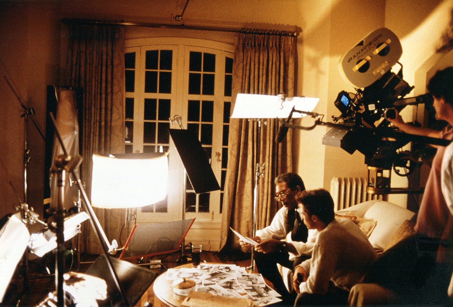
Fortunately, Seven occasionally escapes the phatasmagoric realm of serial murder for respites in the “regular” world, adding delineation between the detectives’ horror-filled profession and their home life. However, warns Khondji, “the only parts of the movie where you really feel sunlight are at the beginning and then the end — the rest is very creepy.” In one brighter sequence at Mills’ apartment, he and Somerset sit on the couch, examining a series of photos before them. Khondji’s lighting setup, placed on the floor in front of Freeman and Pitt, consisted of a small soft-light cut with multiple flags, accenting only key portions of his frame. Explains Khondji, “I often use this technique of using a single source and cutting it so there is just a little bit of light coming through; it looks more natural. And for the eyes, I always use a Kino Flo tube under or over the lens to add a highlight. Flagged off with some black tape, it doesn’t light the face, but just leaves a line across the eyes.”
In completing Seven, Khondji takes with him not only new film techniques but his new passion for Primo lenses. He says, “They are commonly used here in United States, but elsewhere we usually use Cookes or Zeisses. But the Primo is a fantastic modern lens and from now on I will use Cookes or Primos, especially Primos if I am shooting in the city.
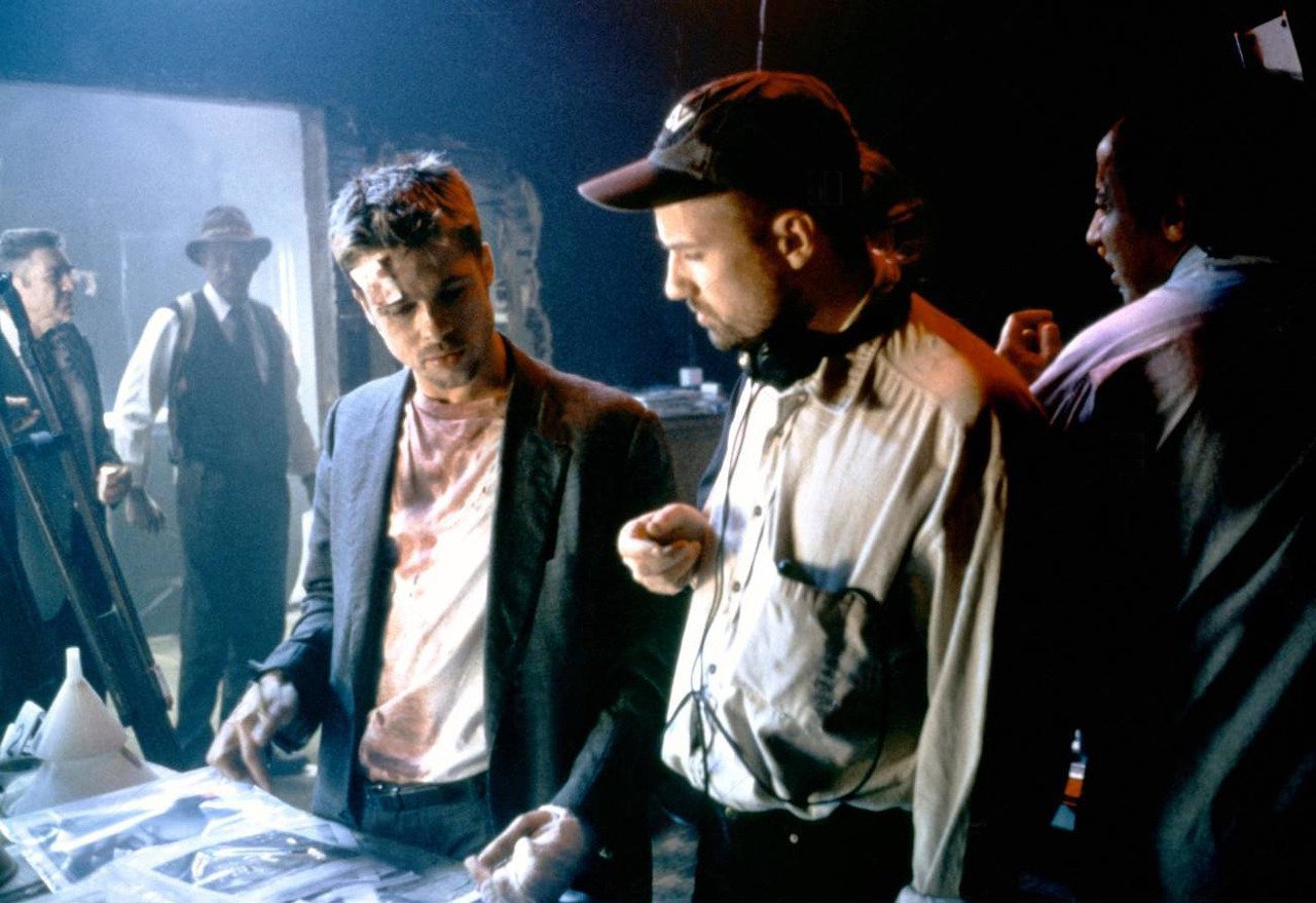
“But what we also did differently on this picture was to underexpose so much, to go into the darkness. And only the director can lead you so far, because you can’t go by yourself. David Fincher deserves a lot of credit. It was his influence that pushed me to experiment and got me as far as I did on Seven.”
Khondji is currently in Italy shooting Stealing Beauty for director Bernardo Bertolucci. Not surprisingly, the situation is an exciting one for the cinematographer. He admits with good humor, “Before I started, I told him that it was like walking on a tightrope. Like looking down to see the films he and Vittorio Storaro had made together. But now, it’s like working beside a source of inspiration that never runs out. I have never shot like this before; it’s incredible. After the first day, the fear was gone.”
ASC members Vilmos Zsigmond, George Spiro Dibie and Steven Poster later recommended Khondji for Society membership. In 2023, he was honored with the ASC International Award.
Seven was selected as one of the ASC 100 Milestone Films in Cinematography of the 20th Century.
If you enjoy archival and retrospective articles on classic and influential films, you'll find more AC historical coverage here.