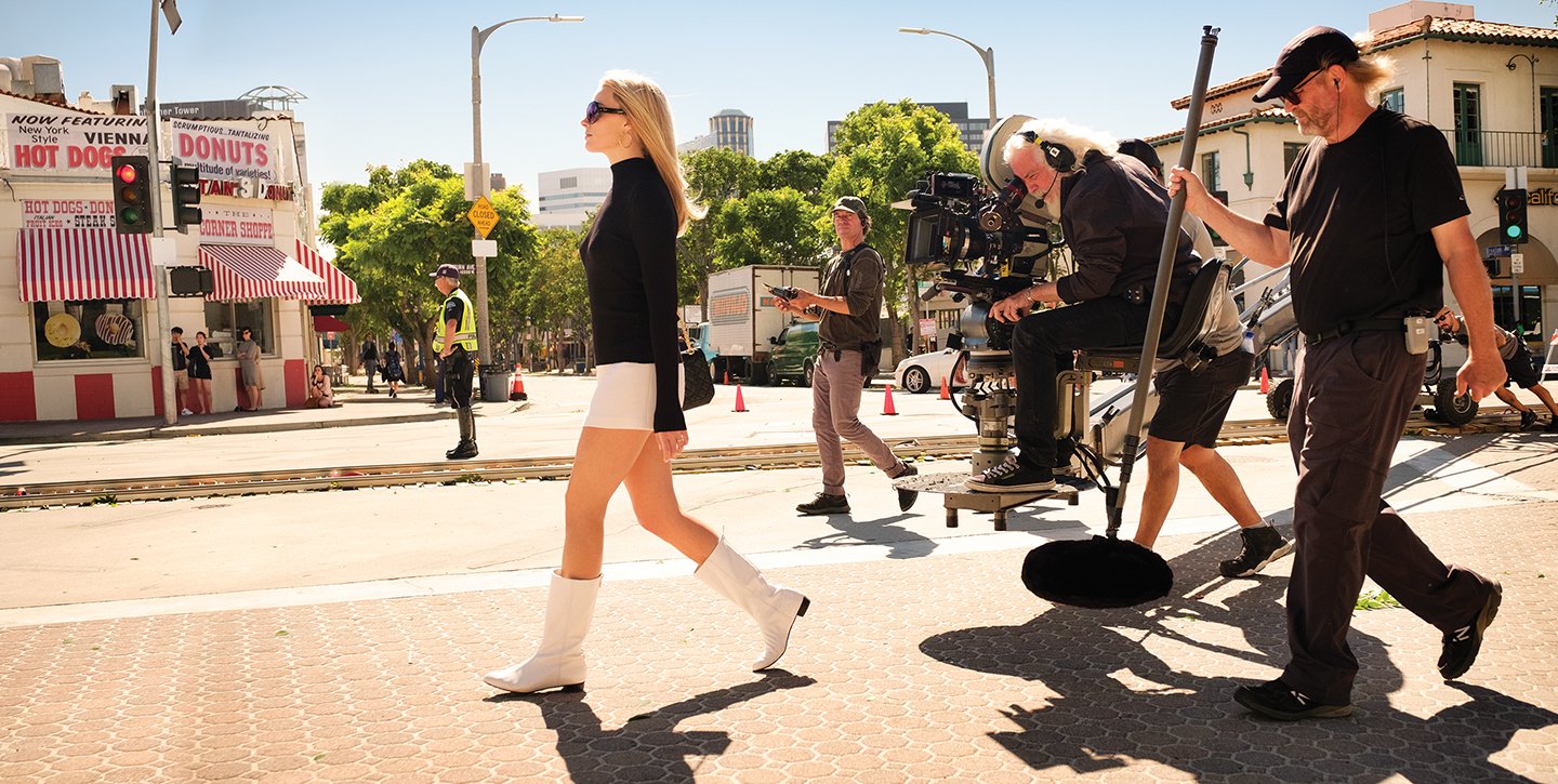
Back in Time: Making Once Upon a Time... in Hollywood
Robert Richardson, ASC and his collaborators discuss their approach — both technical and philosophical — to writer-director Quentin Tarantino’s period Tinseltown tale.
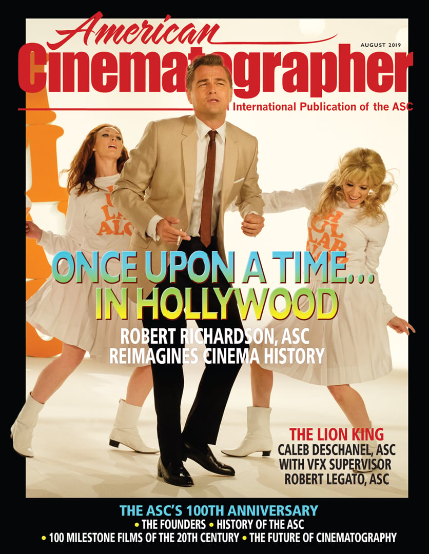
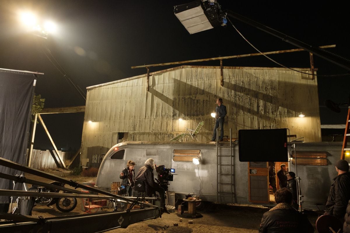
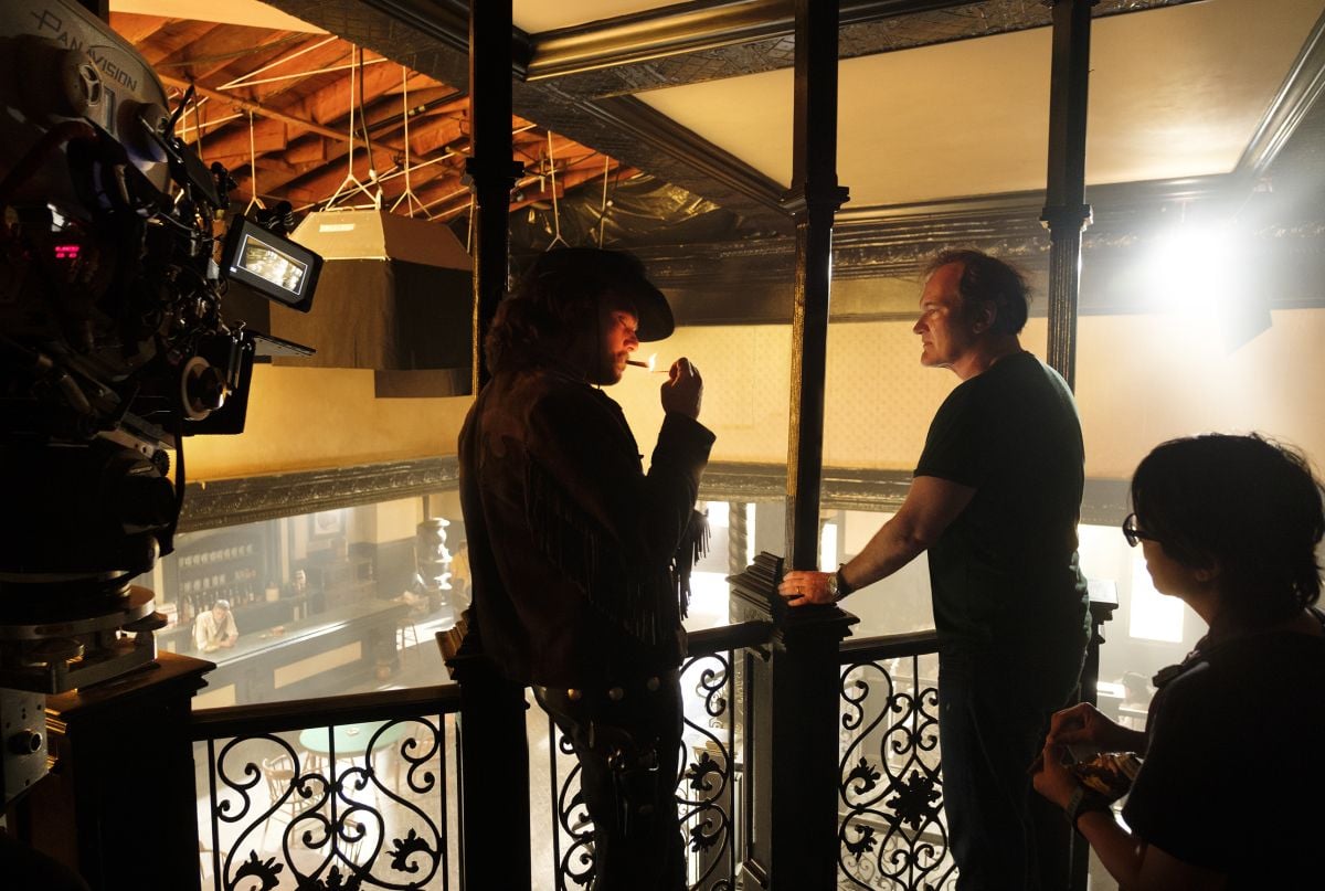
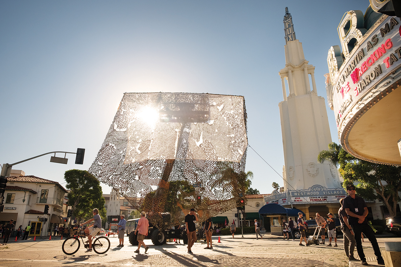
Unit photography by Andrew Cooper, SMPSP, courtesy of Sony Pictures.
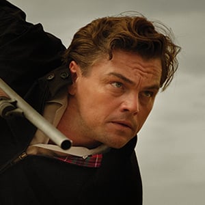
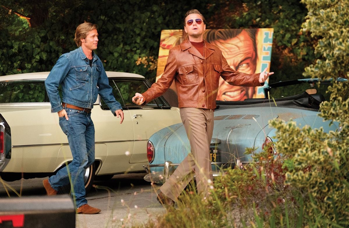
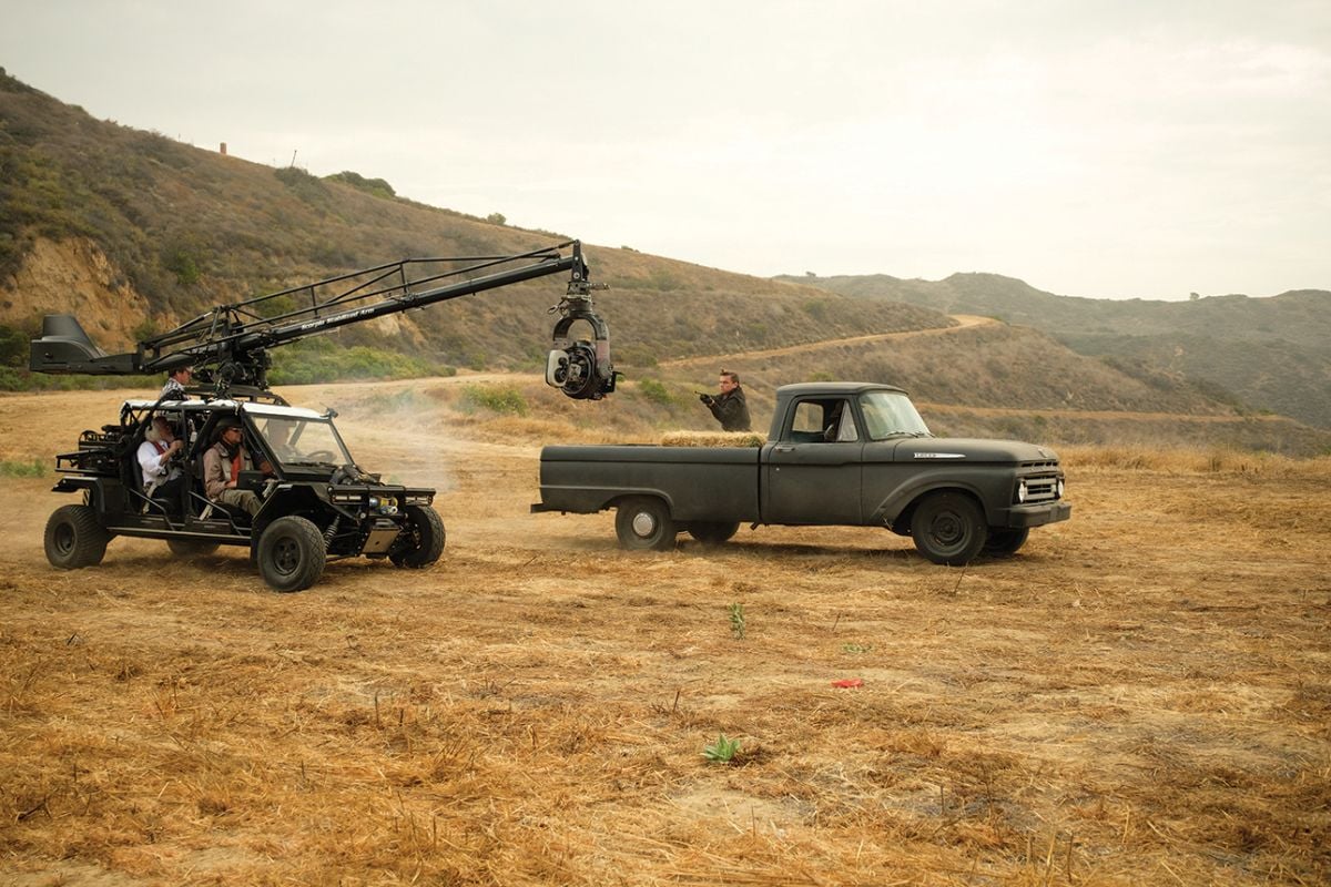
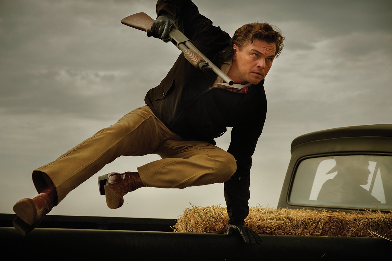
Written and directed by Quentin Tarantino, and shot by his longtime collaborator Robert Richardson, ASC, Once Upon a Time… in Hollywood centers on two fictional characters. Rick Dalton (Leonardo DiCaprio) is a once-successful television actor whose career is faltering; we see him at work on various films, playing a bad guy on a new Western series for television, and debating whether he should go to Italy to do spaghetti Westerns. Dalton’s stunt double, Cliff Booth (Brad Pitt), is a frequent companion both on and off the set, and he also acts as Dalton’s driver and handyman; he appears content with his much humbler life, living in a trailer with his dog.
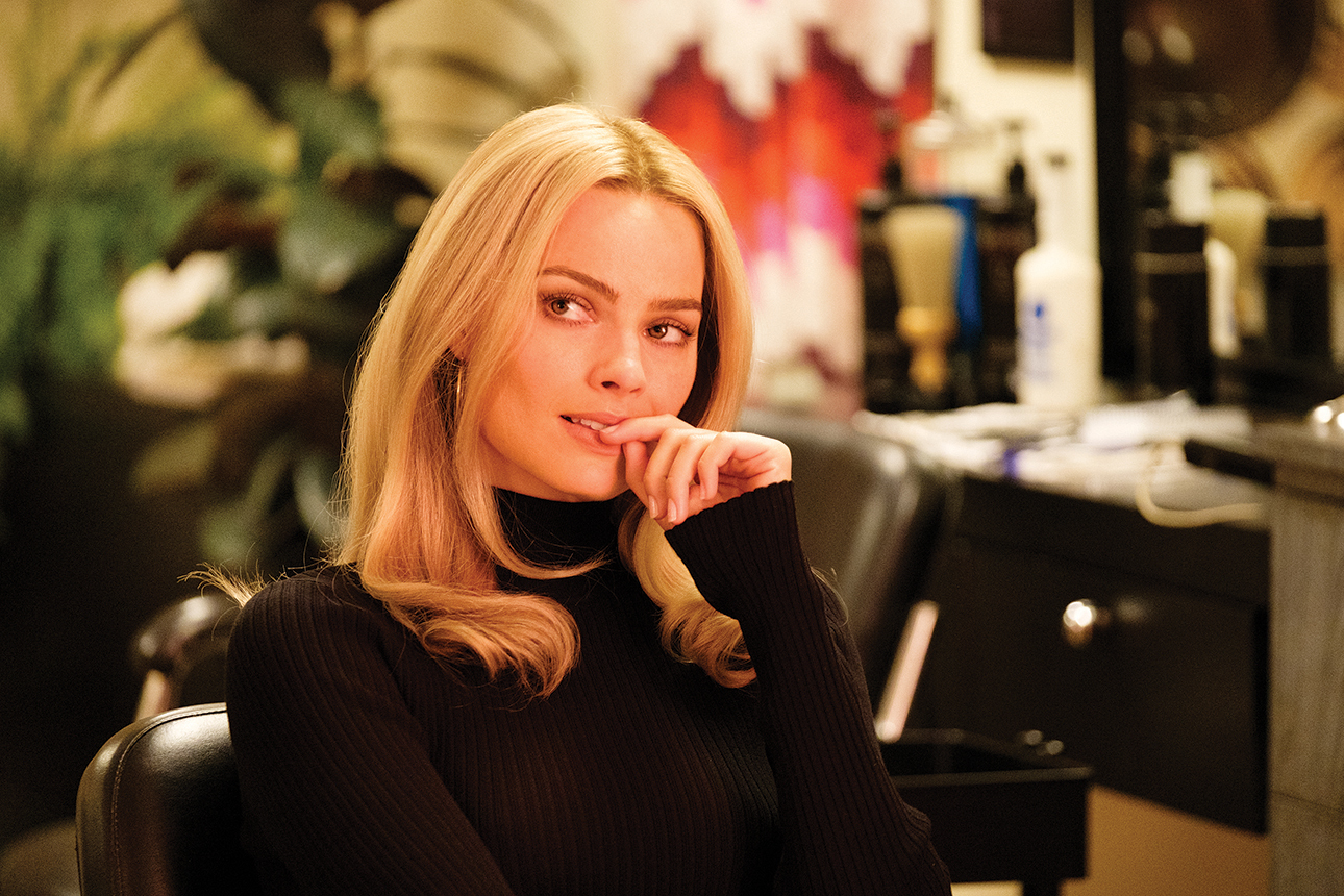
Though fictitious creations, these characters nevertheless cross paths with real-world personalities, most notably Sharon Tate (Margot Robbie), the actor who was killed by crazed followers of Charles Manson in 1969. The story begins in February of that year and slowly but inexorably builds up to that fateful, violent night, with a powerful Tarantino twist.
The result is a “meta-movie” about films and filmmaking, one in which Tarantino masterfully shifts between simulated TV footage and soundstage interactions, between color and black-and-white, between 2.39:1 and 1.33:1, and between onscreen clips and behind-the-scenes anecdotes, with probing reflections about the actor’s job, shooting on a set, and working in the motion-picture industry.
Once Upon a Time in Cannes
Hollywood had its premiere at the Cannes Film Festival in May, where it was the only movie in the Official Competition to be projected in 35mm. During the movie’s Cannes press conference, Tarantino — an undying believer in motion-picture film — was joined by his three leads, and all offered their insights into the feature’s themes.
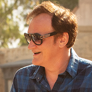
Quentin Tarantino: I’ve done a lot of research on it … how [Charles Manson] was able to get these girls and … boys to submit to him. It just seems unfathomable. And frankly the more you learn about it … the more information you get, and the more concrete it gets, it doesn’t make it any clearer, it actually makes it even more obscure. … The impossibility of being able to truly understand it is, I think, what causes its fascination.
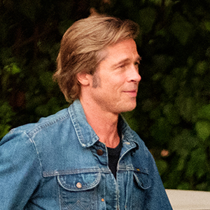
Brad Pitt: I see Rick and Cliff, the two characters that Quentin created, as one individual. And it really comes down to acceptance — acceptance of your place, your life, your surroundings, your challenges, your troubles. In the Rick character, we see someone — hilariously so — feeling put upon by life, and in the Cliff character, a guy who’s gone past that, who is in a place of acceptance with his lot in life, and is quite at peace, who will take whatever comes and knows to figure it out as we go.
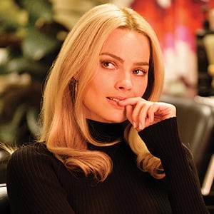
Margot Robbie: Quentin said to me early [that Tate] is the heartbeat of the story. … I just saw her as a ray of light, and I just wanted her to be light. That was my job and my role to serve in this story. … In doing so, I felt like I could honor the memory of real-life Sharon Tate, who so many people said was such a bright light in this world.
Pitt: That time, 1969, when the Manson murders occurred, building up to that … there was a lot of hope, there were these new ideas floating out there. Cinema was new, was being recalibrated. That pivotal moment was a real loss of innocence. I think that’s what the film so beautifully addresses. … I see it as a rage against a loss of innocence.
Tarantino: One of the first people to read the script was my first AD, Bill Clark. … He came down to the house to read it and said, ‘Okay, so this is number nine, huh?’ So he goes out by the pool, and he reads it, and he goes, ‘Damn, number nine is like all eight of [your movies] put together.’
Leonardo DiCaprio: This movie is [Quentin’s] love story to his industry, and he’s put at the helm of it two characters that are outsiders. … The ’60s have come along, and this industry has sort of passed them by. … It’s his love letter to the outsiders of the industry, and that was what was most touching for me.
Colorist Yvan Lucas
A leading colorist who came to the U.S. from France a dozen years ago, Yvan Lucas has worked on 11 features with Richardson, including four directed by Tarantino. AC spoke with Lucas in French.
American Cinematographer: What was your role on Once Upon a Time… in Hollywood?
Yvan Lucas: Dailies and color supervisor, and DI colorist. I worked with associate colorist Elodie Ichter and color scientist [and ASC associate] Matt Tomlinson at Harbor Picture Company, and with dailies color timer Don Capoferri and dailies producer [and ASC associate] Mark Van Horne at FotoKem.
What was the workflow?
This is very different from other features, because not only did Quentin and Bob shoot on film, but they also looked at their dailies on film — and the dailies were later used for an edited workprint. Quentin edits on the Avid, but he conforms the workprint as he goes along so that he can see it projected on a big screen.
The negative was processed at FotoKem, who also printed the dailies and did a 4K scan of the negative using a Scanity. Tomlinson created a show LUT with FotoKem for our digital dailies and for the DI, which was done on a Baselight from FilmLight.
We did a film-out using an Arrilaser at FotoKem and did a contact print from that, which you saw in Cannes. DCPs will also be made from the DI.
What Kodak stocks were used?
Bob shot with [Kodak Vision3] 5219 500T and 5213 200T, along with some Double-X black-and-white [for simulated television footage shown in the 1.33:1 aspect ratio]. We did our dailies and prints on Vision 2383, and our film-out on [Vision3] 2254.
How did you and Bob arrive at the movie’s distinctive look?
The idea was to be very close to the original negative. The dailies were printed directly from negative to the positive print. The unique, vintage quality came from Bob’s lighting and, of course, the production design.
Bob is very demanding for the dailies — so demanding that, afterwards, when we got to the DI, it went pretty easily.
The film has an amazing saturation.
That comes partly from the print stock, 2383. Kodak came out with it about 20 years ago. This print film is very colorful, and the primary colors are really separated and very pronounced. It’s almost astounding. You get true red, green and blue — and Quentin told me, ‘When I see those colors, that’s when I know it’s film.’
Color separation means you can get purer colors?
Yes, exactly. On the print, when you do a neutral color timing with red skin tone, you get back to primary colors. Maybe it’s this separation of color that helps give the feeling of the 1960s. At the same time, we wanted the white in the image to be neutral.
The skin tones are striking, almost painterly.
Yes, but also the faces are modeled like they are in film. They aren’t flat, like you often see today. They are three-dimensional.
The problem of digital today is that when there is no information, it gives you black-and-white, which is ugly. The advantage of film is that, when there is no information, it gives you color. It gives you something in the shadows — some blue, some cyan.
The film also has an amazing contrast — and very solid, sometimes impenetrable blacks.
Yes, the bottom of the curve is dense. We had a quality of blacks on the print that was sumptuous. I think that in digital we want to see so much into the blacks that we lose the character of the image.
People talk about resolution, but what really counts is contrast — and we lost contrast 20 years ago with digital projection, where the blacks are gray, although that’s changing now with Dolby laser projection. Everyone seems to be seeking to get details in the blacks, but on this film we once again have a real print with real blacks. When there is no light in the frame, it’s black!
Tell me about the show LUT that was created.
Our reference was the negative printed onto positive. The LUT allowed us to see the same thing as the dailies, but in digital. We did a lot of fastidious work on the LUT. We had the characteristics of the combined negative and positive baths from FotoKem, but I continued to adjust the details of the curve during the first four weeks of our dailies.
So the film print dailies were your image reference for the DI?
Yes. On one side we had a print that Quentin was looking at, and on the other we had a monitor that we were looking at. We used the latest LG OLEDs, which are the best around today.
So you decided to be faithful to the negative and print, and you ended up with something that evokes the 1960s.
Yes, but the image is also saturated and contrasty because of Bob’s lighting. He shot with a single camera, and he did some old-school lighting that he would not have done for a contemporary film. Also a lot of the film takes place in daytime, which is naturally luminous and contrasty.
It’s old-school, but the look also feels new and contemporary.
There are fashions in film images. But it’s better to create fashion than to follow it! [Laughs.]
When I was in France working on Delicatessen with Darius Khondji [ASC, AFC], I was very into desaturation with a bleach-bypass process. Now, for me, color is back. And this film with Bob is the apotheosis of color! I never would have made red skin tones 20 years ago, but we managed to do that without being excessive, without pushing it too much. It’s pleasant, it’s pretty.
Many of the films today are desaturated. I hope that this film will show people that — damn! — we’ve almost forgotten what real colors are!
Vintage, With a Twist
In Hollywood, timing is everything. And so it was for Panavision’s T Series anamorphics, which make their 35mm-film screen debut in Quentin Tarantino’s Once Upon a Time… in Hollywood.
Here they join a bevy of lenses recruited for the multiple formats contained within this homage to old Hollywood: 2.39:1 anamorphic for the main narrative, along with 1.33:1 spherical black-and-white to emulate the old television shows and movies in which fading star Rick Dalton (Leonardo DiCaprio) and his stunt double, Cliff Booth (Brad Pitt), appear.
When Robert Richardson, ASC went to Panavision to gear up, “his original plan was to use the same package he’d used in the past — C Series and E Series on a [Panaflex Millennium XL2] film camera,” recalls ASC associate Dan Sasaki, Panavision’s senior vice president of optical engineering. However, Sasaki adds, the filmmakers “wanted to shoot inside 2 feet,” and the close-focus capabilities of those vintage lenses — the C series having been introduced in the 1960s, the E Series in the 1980s — simply wouldn’t accommodate that approach.
So the lens engineer introduced Richardson to Panavision’s T Series anamorphics, which were first introduced in 2017. “Those have the most modern coatings, the best close focus, and the latest technology available,” Sasaki says. “We used cylinder designs we’d not even considered in the past to keep the anamorphic aesthetic but eliminate the limitations of falloff that occurred with our older lenses. It’s more of a modern twist.”
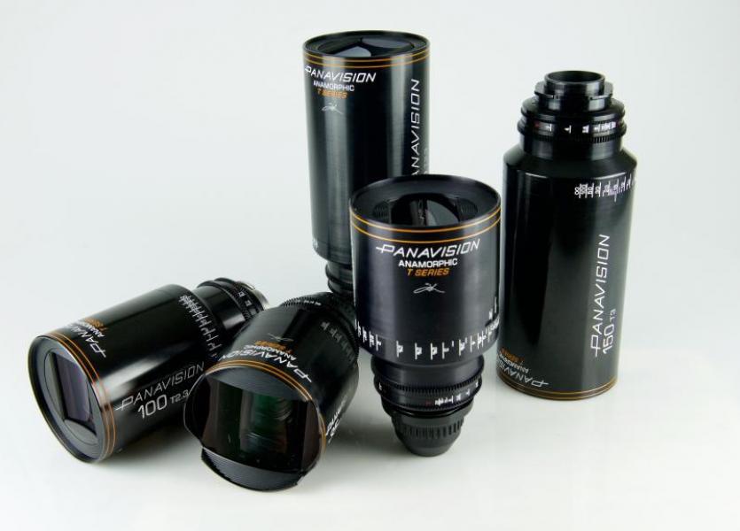
The problem was, the T Series had been designed for digital cameras, period. As it happened, though, Star Wars: The Rise of Skywalker was prepping around the same time, and Sasaki had just reconfigured the rear halves of a set of T Series lenses for that 35mm and 65mm tentpole, which premieres in December. “We realized we’d made a mistake by not making them film-compatible,” Sasaki admits. “It’s amazing how much film work we’re doing. Not only in 35mm, but large-format as well.”
When Sasaki suggested the T Series to Richardson, “there was a bit of hesitation,” Sasaki recalls, noting that the cinematographer expressed concern that the lenses were “going to be too modern, not fit the mood, not cut in well. But as it turned out, he liked the way they worked on film — and liked the fact that [up through the 135mm prime] they could be used at T2.3 without having any compromise in quality.”
According to 1st AC Gregor Tavenner, “The T Series are modern lenses with a very deep contrast and a more perfect resolution, which is very attractive in certain circles. It becomes another arrow in the quiver. It’s a magical collection of choices that Panavision has.” In addition to the full range of T Series primes — 28mm to 180mm — the production also carried the series’ ALZ10 42-425mm (T4.5) zoom, among other Panavision anamorphic zooms. “It’s a beautiful lens, built upon a legacy,” Tavenner states.
He estimates their use of the C, E and T Series was about evenly divided. (Panavision’s vintage Ultra Golden Panatar high-speed anamorphics also came into play for night sequences.) “There was no blanket recipe as to which series we would use,” says Tavenner. Decisions were shot by shot. “Different focal lengths react in different ways,” he adds. For instance, “I found specifically that an older 28mm had a more attractive field of view than the modern 28mm. So they all have their advantages.
“With skill,” Tavenner continues, “you can intermix the series seamlessly. Even if there is a technical difference, you can counteract that with choices of filtration or light. You can accentuate the differences or smooth the differences.”
For his part, Sasaki retooled all of the older lenses to improve their mixability. “We played with swapping out elements to give them flare characteristics that were a bit more consistent,” he says, “because some of the lenses would flare one way and others another way. We tried to match them.”
Much of the action for the fictional TV Western Bounty Law was captured on spherical zooms. “We had two older Panavision zooms, which are still very attractive to this day: a 6-to-1 20-120mm [Z6S (T3) Panavised Angenieux zoom] and a classic 20-100mm [Z5S (T3.1) Panavised Cooke zoom],” says Tavenner. Standard Primes, which Panavision introduced in the late ’60s, played a supporting role.
The fact that Tarantino insisted on doing both film and digital dailies meant the camera team could minutely inspect the various lenses’ performance. “A first-generation film print projected on a movie screen — it’s a gift from the gods,” Tavenner enthuses. “You see these nuances of color and control and lens quality, the very subtle differences in lens design, and the tweaking that we do.”
Tavenner appreciates the old-school approach taken throughout the production. “Not only is the movie an homage to the ’60s, the way it was made is an homage to the grand, classical way of making movies.” — Patricia Thomson
Gaffer Ian Kincaid
Ian Kincaid has been Richardson’s longtime gaffer. The duo has teamed on 18 features to date, including six directed by Tarantino.
You’ve known Quentin Tarantino for a long time.
Ian Kincaid: I first met Quentin when he was a clerk at Video Archives in Manhattan Beach. Quentin already had the same high-energy enthusiasm and an encyclopedic knowledge of film. He was the ultimate video clerk!
And he would recommend movies to you?
Stacks of them. And I would say, ‘Quentin, I can’t possibly watch 12 movies in the two weeks that I have to rent these.’ And he would say, ‘Why not? That’s just one or two a day.’ He still can’t comprehend how the rest of us can’t keep up with his voluminous consumption of film and television.
How do you construct the lighting on the set with Bob Richardson?
Most of our lighting evolves. We start with broad strokes: big guns through windows, or big bounces, and then as we get the lens up and start to see the framing, we say, ‘Okay, there’s a place to hide a backlight over here, an edge light there, or a little fill bounce here.’ It’s a process.
I imagine that you two speak in shorthand.
Bob will say things like, ‘I want something screaming through that window’ or ‘Give me a soft glow’ — or he may just wave his hand and say, ‘Do something like that’ — and I’ll know exactly what he means.
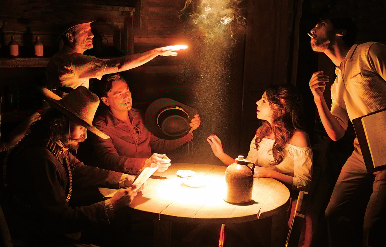
How did you light the scene of the Western that’s being shot inside a saloon set?
We shot on Universal’s Western Street set. For the shots facing the windows, we covered the street with Charcoal Grid so that the outside didn’t burn out. We had three K5600 18K Alphas creating matching shafts of sunlight through the windows and door.
![Charcoal Grid Cloth hangs over the Universal backlot’s Western Street set “to eliminate frontlight on background action and buildings,” Kincaid explains. “[K 5600] 18K Alphas were cantilevered on truss mounted to condors to illuminate the interior of the saloon. Flags rigged to the truss isolated each of the HMIs to a specific window so the separate sources weren’t revealed in the atmospheric smoke.”](/imager/uploads/76396/OUTIH-10-P1050563-x_6c0c164bd2b597ee32b68b8b5755bd2e.jpg)
Inside we made a big soft source by bouncing a Maxi-Brute [with 12 1K PAR bulbs] into muslin, and then back through another muslin. Some people call that bounce-diffusion combination a ‘book light.’ For Leo’s close-up, we added what we call a ‘low glow’ floor bounce from a K 5600 1,600-watt Joker above. The source is warmed up a little by using unbleached muslin and ¼ Straw gel.
You favor muslin for your soft sources.
We try to use organic materials like muslins whenever we can. We use plastic Grid Cloth, but we avoid it when we can, and we try to ban Styrofoam beadboards from the set — I live at the beach, and we see a lot of Styrofoam floating around.
Why did you choose Maxi-Brutes for bounces?
They’re easily adjusted without dimming or changing the color — you can take out 1⁄12 of the light with each switch. And you can pan the banks to spread the light wider or focus it tighter. Maxis are not part of what I would call ‘modern filmmaking,’ where people try to light without generators, just plugging into the wall — which is becoming easy to do with LEDs. Maxis are heavier on the crew, but they are a really soft, powerful, adjustable light — and, in my view, they’re creamier.
You had some huge night exteriors on this film.
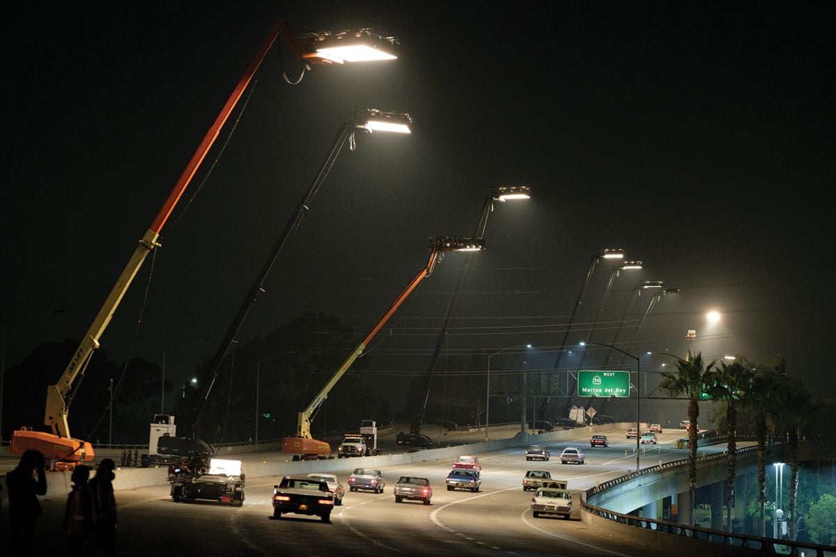
Our biggest lighting setup was about three quarters of a mile on the Marina del Rey freeway, which we closed down for one night [for a scene in which Booth drives home]. Most of that was shot car-to-car. We put nine 80-foot condors on the opposite side of the freeway. Each condor had two Arri T12s creating pools of light, and four soft boxes through a neutral Grid Cloth for an ambiance between those pools. The soft boxes were 4-by-8-feet with six 1Ks inside.
So each condor shone down 24K of hard light and 24K of soft light.
Yes. We also placed some lights on freeway overpasses and on-ramps.
The scene driving down Hollywood Boulevard in 1969 is an amazing re-creation of the period.
It was a major undertaking. We lit one three-block section, then took it all down and did another three blocks. It represents weeks of work by 20 people on the rigging crew — led by rigging gaffer John Manocchia — and probably another 20 set dressers. Hollywood Boulevard was meticulously and faithfully restored to how it looked 50 years ago.
How did you light the street?
There were four of our condor tungsten sources at each intersection; each condor had four 6K soft boxes with a Full Grid diffusion and a 1⁄2 Straw to warm it up. And the rest of the exterior is a mélange of everything! We put strings of bulbs wrapped in Teflon underneath the awnings; each string was on a dimmer channel. We hung [2K] Blondes on every light post, and then hundreds of practicals. We changed out all the marquees to LEDs.
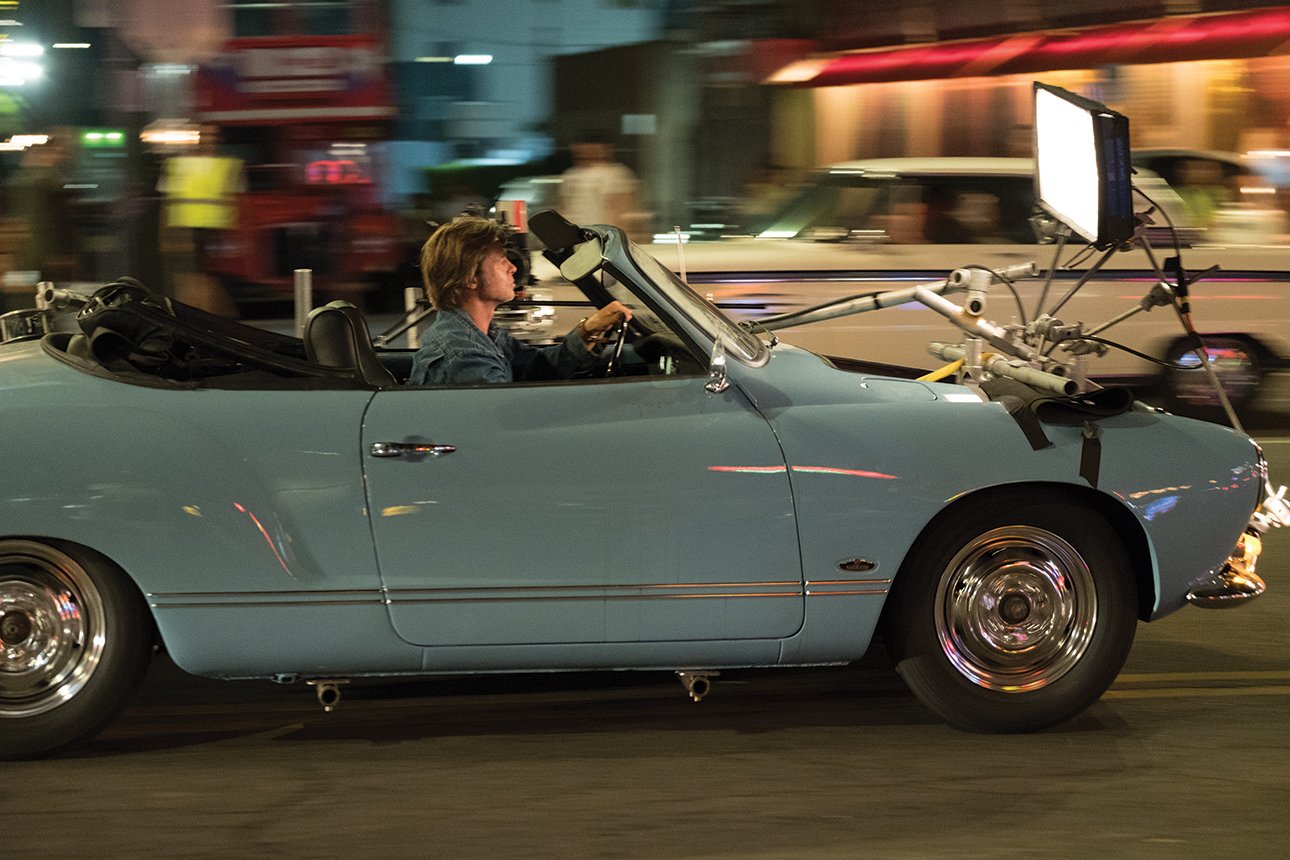
How did you light DiCaprio and Pitt in the car?
Their car was towed down the Boulevard on a lowboy trailer. Brad and Leo were frontlit by a 2-by-8-foot soft LED box with LiteTile from LiteGear. We went to 2,600 or 2,800 Kelvin, and we could easily fluctuate the light a little as we drove. When Brad drives his convertible, we used a 2-by-4-foot LiteTile on the hood.
The scene where the Manson Family attackers talk inside the car is very, very dark.
We set up a muslin soft source on one side, and put a 2-by-8-foot and a 2-by-4-foot LiteTile LED soft source in front of the car. The great thing about LEDs is that they’re micro-adjustable. I can take them down 1⁄10 of a stop or less. So we position them and then use them as much as we need them, or take them down very low like we did there.
Anything you’d like to add?
I’d like to thank my crew. Also key grip Chris Centrella and his team deserve at least 50 percent of the credit for the lighting on this film, because there was so much negative in exteriors. And thanks to Bob Richardson for pushing everyone to be their best.
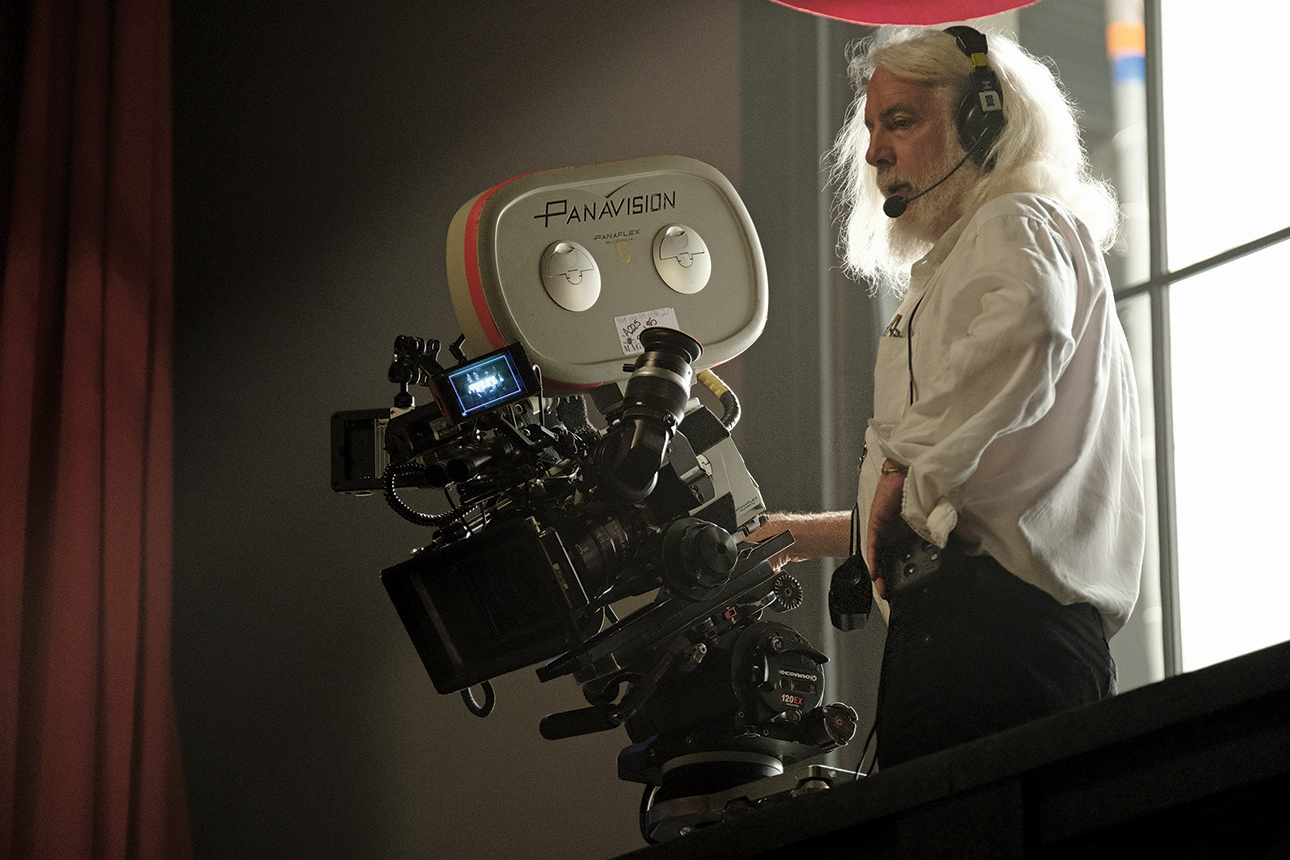
Cinematographer Robert Richardson, ASC
Once Upon a Time… in Hollywood marks the sixth feature collaboration between Tarantino and Richardson, the latter of whom was feted earlier this year with the ASC’s Lifetime Achievement Award (AC Feb. ’19).
You’ve been shooting with the same core team for decades: key grip Chris Centrella, gaffer Ian Kincaid and camera assistant Gregor Tavenner.
Robert Richardson, ASC: They are all the very best that I’ve ever worked with. And they push me creatively. They teach me new ways of solving problems, or different ways of using the same tools.
Once Upon a Time has a striking look. It feels contemporary, but it also evokes the period of the late 1960s. It’s something old and something new.
Exactly. The aim was to evoke the past and the present. Quentin and I wanted to have a look that was here and now, but that also pushed a little bit back in time. We didn’t speak about it, but in my mind I thought, ‘Let’s make something past, present and future.’
Ian Kincaid detailed the considerable lighting involved, notably in some of the night exteriors. Many films today don’t use that much light.
I believe that we need to shape images towards a story. Quentin wants to tell a story. He shapes his words, his paragraphs, his pages, and he wants a look that is shaped in a similar way — a look that will not just say, ‘This was made in 2019, and we decided that we wouldn’t light.’
So deciding to light a lot was part of shaping the image?
Yes. Compared to what I would do nowadays, I overlit. Sometimes I held back on lighting to some extent, but I was still trying to be expressive. For example, when Brad is in the car with [Margaret Qualley], I lit them with an HMI and light diffusion, and I wanted to make that light more obvious than I normally would. I can see that Brad’s lit — normally I would try not to do that. However, I didn’t want to overlight it to the point where the background out the window was at the same level as the faces. I tried to balance different aesthetics from different time periods.
Does Tarantino comment on your lighting?
There is nothing that Quentin does not comment on. If he is looking for a specific feeling, he talks to me about it prior to shooting. For example, when the Manson Family attackers talk in the car, Quentin wanted very deep blacks. That was one of the hardest scenes to achieve. I was close to a stop and a half down in exposure, using LEDs to give it a not-lit darkness feel. I struggled but eventually found what you saw in the film.
This film is about light and darkness.
It certainly is. And Margot as Sharon Tate is the ray of light that lifts the entire film.
Yvan Lucas explained that the reference for the DI look was the dailies print.
Yes, because Quentin wants film, so the print dailies are his visual reference. That’s why Yvan was involved from the very start, because we needed to create a dailies look that Quentin liked. This meant that I had to create the look on set — it wasn’t about creating it in post — so what I’m looking at through the lens is what I will see in the DI. This is not how I like to work. I prefer the control in DI. But here I had to live by my dailies. We re-created in DI what Quentin saw in dailies. Those film tones are hard to emulate digitally with a LUT, but it was made possible by FotoKem’s desire to continue to create at a high level, and by Yvan’s knowledge of film — he’s the best in the world that I’ve encountered.
The movie has a very striking texture — this strong contrast and strong saturation.
Many of the films coming out these days are looking very similar. We wanted to try to find a look that’s different for this movie. To provide deeper saturation, the costumes and makeup had to shift, so we had a number of talks in preproduction with production designer Barbara Ling, and about costumes and makeup as well.
The skin tone is very saturated.
Yes. Where possible we had all the tungsten and LED lights on dimmers, and they were generally warm to give that quality to the skin.
Do you and Quentin collaborate on setting up shots?
Quentin is a master who comes to set with a number of shots he wants to accomplish that day. Whether we shoot with a crane or dolly or whatever is less of a concern than achieving what he has on his list. The crane has become second-nature to the two of us, and to the entire crew. We can directly create many of the shots he wants with it; we don’t have to map it out. I collaborate with Quentin on compositions because I am the operator. He favors medium shots or wider. If he wants to center punch, we center punch — or if he is fine with moving to a composition with negative space, then we do that. Quentin and I are very much in alignment now. Over the years I have learned how to anticipate what he is looking for, and hence there are few times we are out of step with each other. At this point in our relationship, there’s complete trust. I’m extraordinarily fortunate to have this relationship. I only make what Quentin wants.
How do you approach lighting people?
My approach is to place the light in the best position for the person I am photographing, that position which is most attractive in my opinion. That is usually a soft bounce from a distance away, or a backlight mixed with a soft bounce, as in the case of Steve McQueen [Damian Lewis] at the Playboy Mansion party. I tend toward a soft bounce with Maxis, Nine Lights or Dinos, but there are always reasons for Fresnels. For example, when the Manson Family walk up Cielo Drive before their attack, they walk in darkness partly lit by a 20K backlight, as I wanted a single shadow moving towards camera, and the fill to be a passive bounce back.
Your signature toplight bounce is less present in the film.
It’s been less present for a long time. For example, I could have lit the scene in the Musso & Frank restaurant by hitting the table with a toplight. But the desire to be more classical took me to another path. There were times I played with the hard light in the film, but rarely.
![DiCaprio sits across from Al Pacino (playing Marvin Schwarzs) in Hollywood’s Musso & Frank Grill. “All lighting fixtures were rewired, repaired or replaced to be able to accept larger-wattage bulbs that we dimmed to photographically pleasing levels and color,” Kincaid explains. “A Maxi-Brute bounce provided the key light, and two 2-by-8 LiteGear [LED units] were dimmed up to increase backlight or lessened to reduce fill as the camera tracked.”](/imager/uploads/76403/OUTIH-06-QT9_18277-x_6c0c164bd2b597ee32b68b8b5755bd2e.jpg)
There are shafts of hard light coming into the saloon set, and a similar source in the scene afterwards in the trailer, when DiCaprio’s character rages at his own bad acting.
That similarity was intentional. In the saloon we ended up with a mixture. We had our HMIs coming through the windows, but the sun happened to move into the same exact angle, so we ended up with a fortuitous combination of HMI and sunlight. If you look closely, you can tell the difference because the HMI is slightly cooler.
Tell me about the day exterior where Pitt’s character visits the Manson Family at the Spahn Ranch.
It took us approximately four days to cover all of the scene, which ostensibly takes place in an hour or less. It’s the difficult problem where you’re not going to have continuity of light and hence can’t be consistent shot to shot.
The scene cuts between different times of day, but the intention is that the audience will not notice.
That took courage on my part. That’s where you learn you’re wrong, but you must embrace it and make it work. That’s growing.
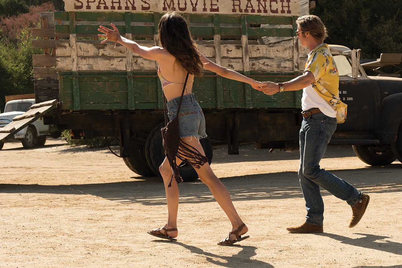
I love the scene’s yellowish color.
It reminds me of Wim Wenders and Robby Müller [NSC, BVK].
You’ve told me that you can get into a different headspace when you’re behind the eyepiece, operating the camera. You’ve called it ‘the cave.’
I don’t really know how to talk about it. The cave is a zone — it is a complete blackout. The world around me disappears other than what I see through the viewfinder. It is the place I love most in this world, a place of complete focus. My eye sees everything at once, so I’m able to move rapidly to corrections, or I’m simply watching the performance by an actor. I’ve hit this zone in meditation, and I hit it virtually every single time I shoot.
That seems like a real gift, to be able to access this zone every time you go to the eyepiece.
Yes, I go there, but my talent doesn’t always move that way. I can see, but only as far as my capabilities allow. You can only achieve as much as your capacity to draw upon your vision. And vision’s a complicated journey. It requires a great deal of sacrifice. And it also takes scholarship to progress. Otherwise you fall into the patterns that many critics like to refer to as: ‘This is what they do.’
You mean like, ‘Bob Richardson? Oh, yeah, toplight bouncing off the table.’ I’m sorry, I was just guilty of that.
‘We miss Bob. He did that, now he doesn’t do that. What happened? Oh, wait, he did it again.’ [Laughs.]
What do you think the film is about?
It’s about mortality, about the recognition of when we slowly begin to fade from a place in the spotlight to somewhere else. [It’s also] a celebration of a time period in Hollywood that was shifting — as Quentin has said, it is his love letter to Hollywood.
DiCaprio’s character says, ‘I’m a has-been.’
A star is either moving towards the top or falling towards the bottom. How do we deal with that? If you look at Brad and Leo in the film, they’re more or less the same character. Brad’s side has this flow — he just flows with it — but Leo’s side is the one responsible for how they both make a living. Let me ask you: How do you feel about your career at this time in your life? I question my marks all the time.
I want to be Brad, but I’m Leo. [Laughs.]
Me too. I’ve always been that way in my work. I’ve never known how to go into the next film. This film frightened the hell out of me to shoot. It’s an epic. I didn’t know how to achieve what I wanted. I’m not that talented a DP.
What? I beg to differ.
I’m saying I’m not that good. I could be so much better. I don’t know how to shoot a movie. I don’t know what I’m doing. Every time, I start from the beginning.
This mixture of fear and self-doubt may be part of the artistic process. Does it go away once you start shooting the film?
It’s always there in the background, but that doesn’t mean that it doesn’t subside.
Does your collaboration with other creative people help?
Yes. When you’re linked to a great director, they shift you, they move you. They’re part of the reason that we all move forward, that we become better at our craft — if there’s a capability within us to allow that to take place. My relationship with Quentin is immensely personal. If I don’t love my director, then I’ve made the wrong choice. It’s the same thing with Quentin as with Marty [Scorsese] or Oliver [Stone]. They want to guide you to their vision, just like they guide the actors. I go with them. That’s my job. These films are possible because they’re made with love, with people who believe in inner creativity.
In the power of creativity to change us?
Wouldn’t that be great?
2.39:1, 1.33:1
Anamorphic and Spherical 35mm
Kodak Negative Stocks Vision3 5219, 500T, 5213, 200T, Double-X 5222
Panavision Millennium XL2, Panavised Arriflex 435 (for high-speed shots)
Panavision C Series, E Series, T Series, Ultra Golden Panatar
Panavision Standard Primes, Primo, Ultra Speed
Panavision Z6S, Z5S
Digital Intermediate
Printed on Kodak Vision 2383
AC previously covered Tarantino’s debut feature, the crime classic Reservoir Dogs, as well as his first collaboration with Bob Richardson, the revenge fantasy Kill Bill, as well as their revisionist WWII drama Inglourious Basterds and satiric Western Django Unchained.
Richardson was honored by the ASC in 2019 with it's Lifetime Achievement Award.
For access to 100 years of American Cinematographer reporting, subscribers can visit the AC Archive. Not a subscriber? Do it today.